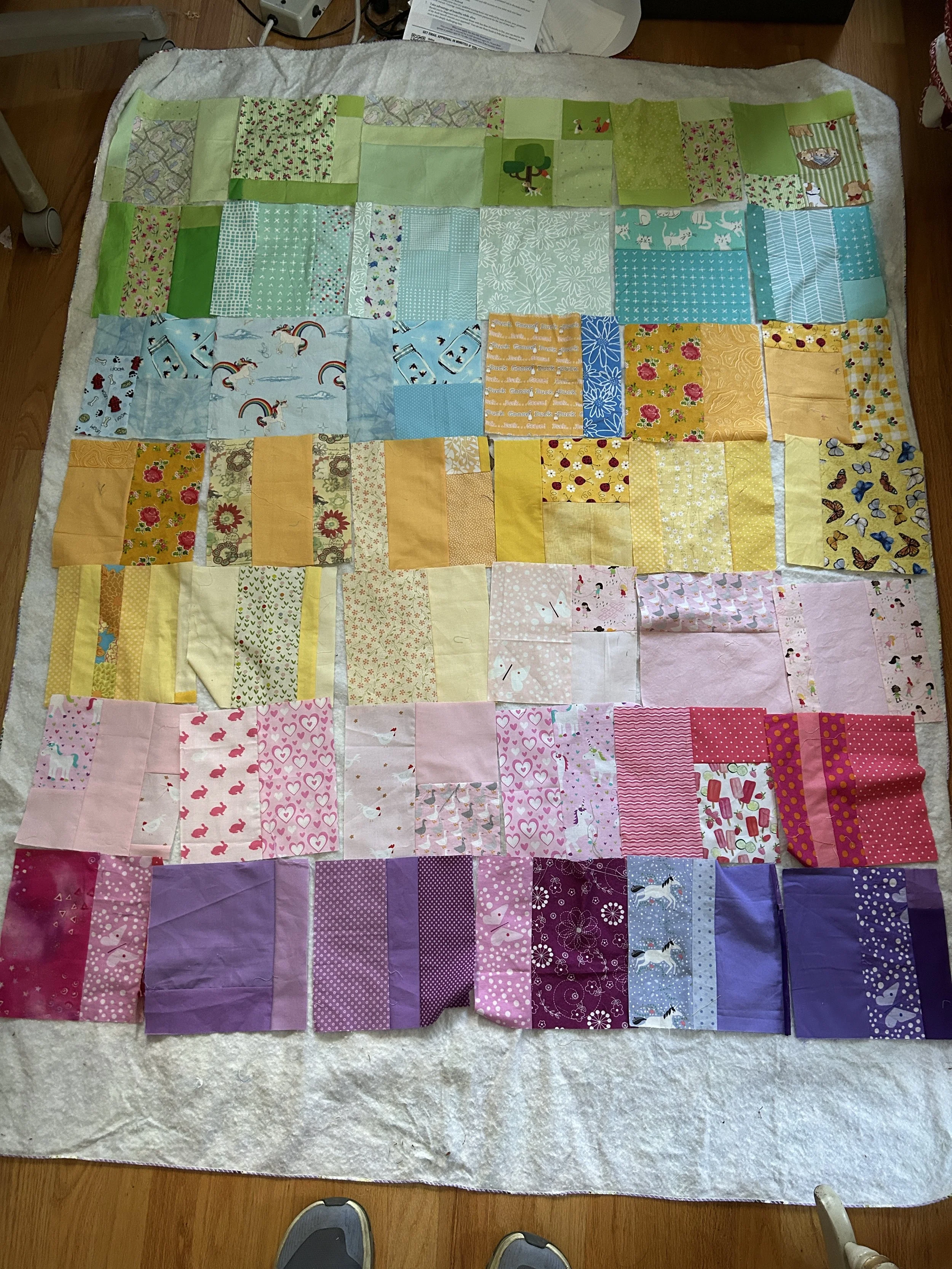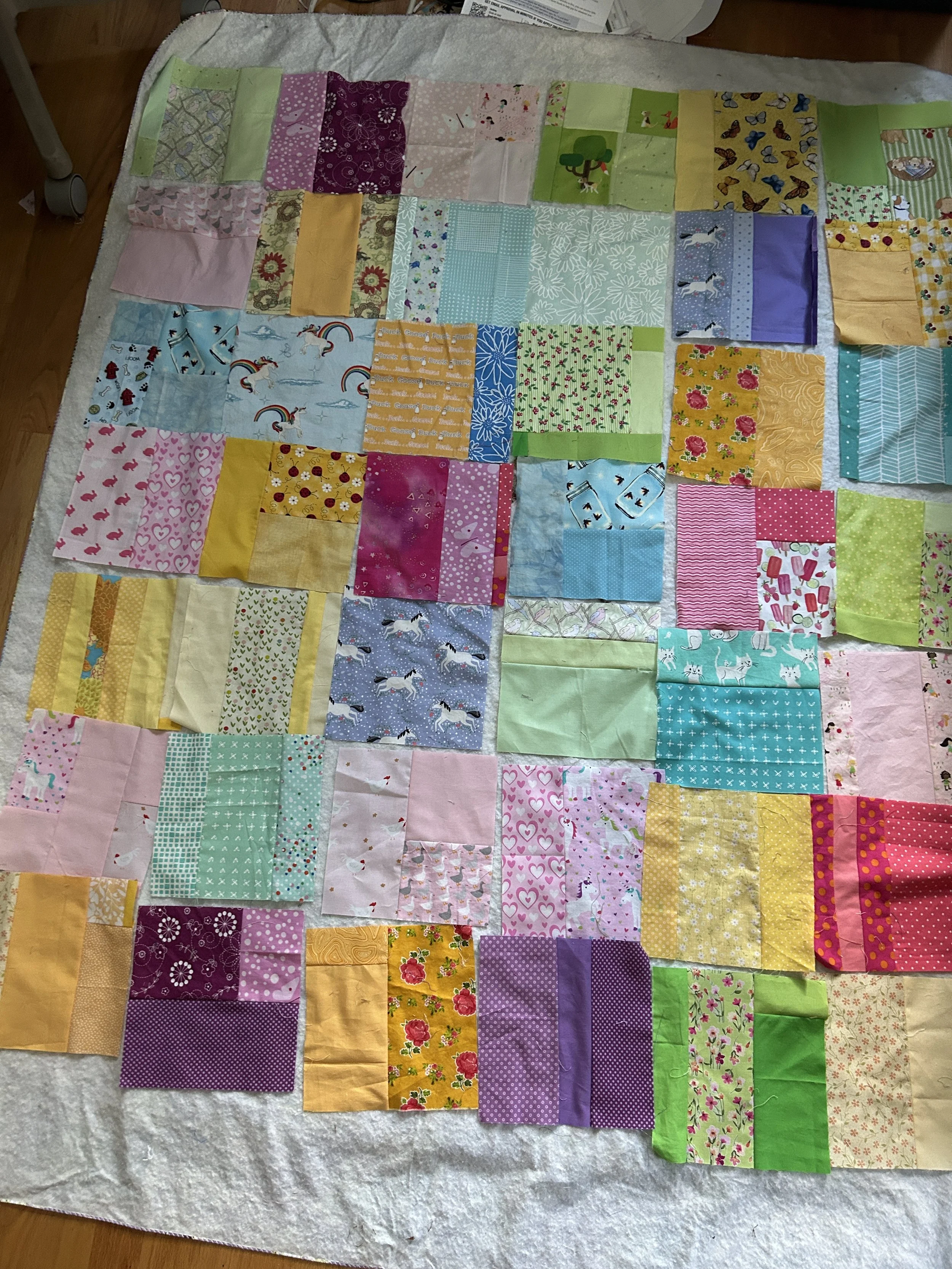
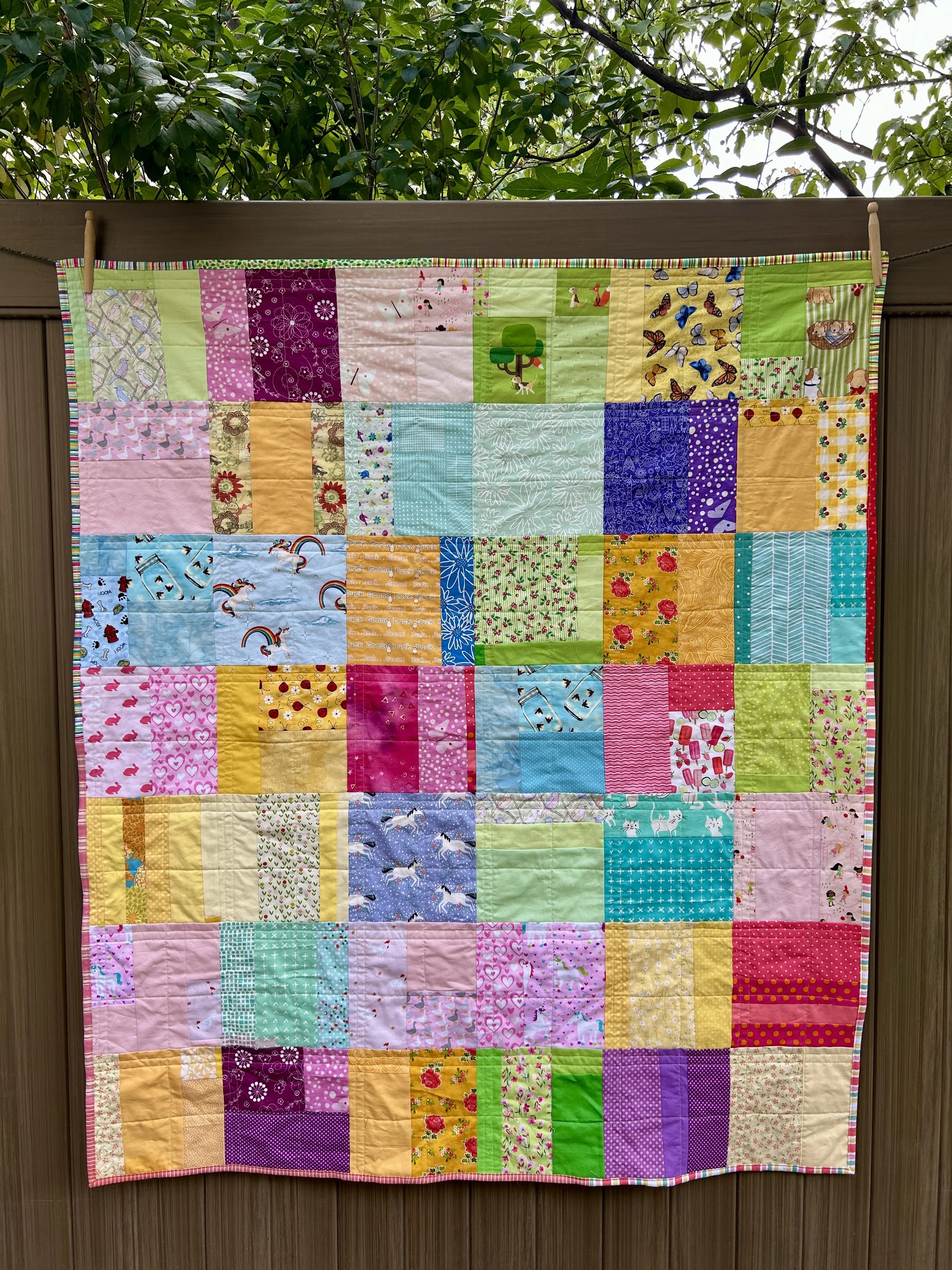
“What Can You Find?” Child’s Quilt 46 x 64 inches
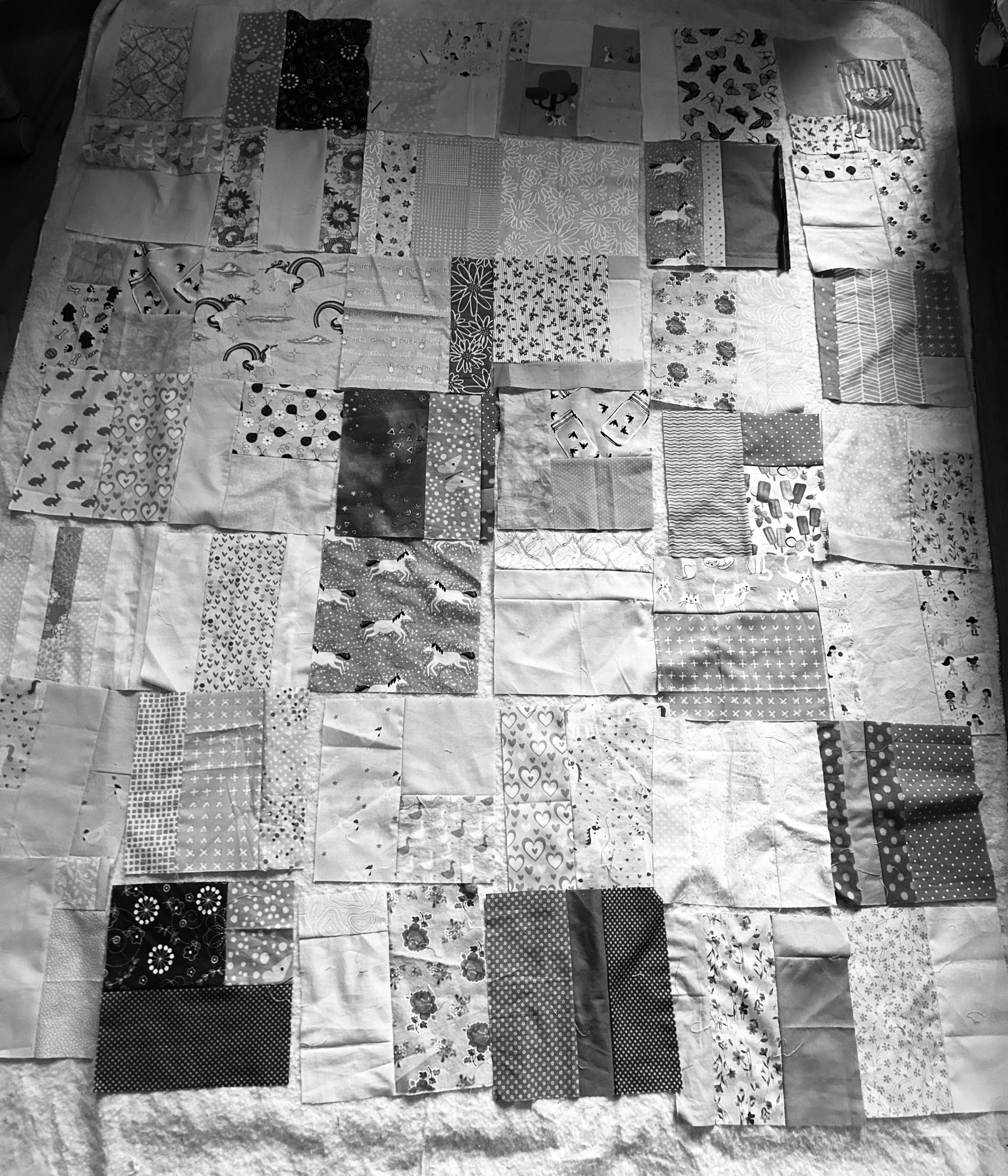
The weather finally cooled down a bit so I got the second of my waiting quilt tops quilted. I posted about the colorway for this quilt on August 13, 2026 and about choosing the final layout for my slabs on August 20, 2026.
I chose the fabrics for this quilt out of my stash just for their colors. But it has turned out to be an great I Spy quilt as well. (An I Spy quilt has lots of “hidden” animal or objects for a child to find). So that makes it a fun quilt, as well as a colorful one. I’ve made several I Spy quilts, but now I’m wondering if they are actually EYE spy quilts. Either title works I think! Here’s photo of a very traditional I Spy quilt I made from a pattern I found online years ago that was available to be used for charity quilts. I was so long ago, I no longer remember where I found this pattern and I couldn’t find it now with a quilt search.
The fabrics for this new quilt are all from my stash, and the binding is, once again, a collage of binding scraps. I have to say, I love scrappy bindings!
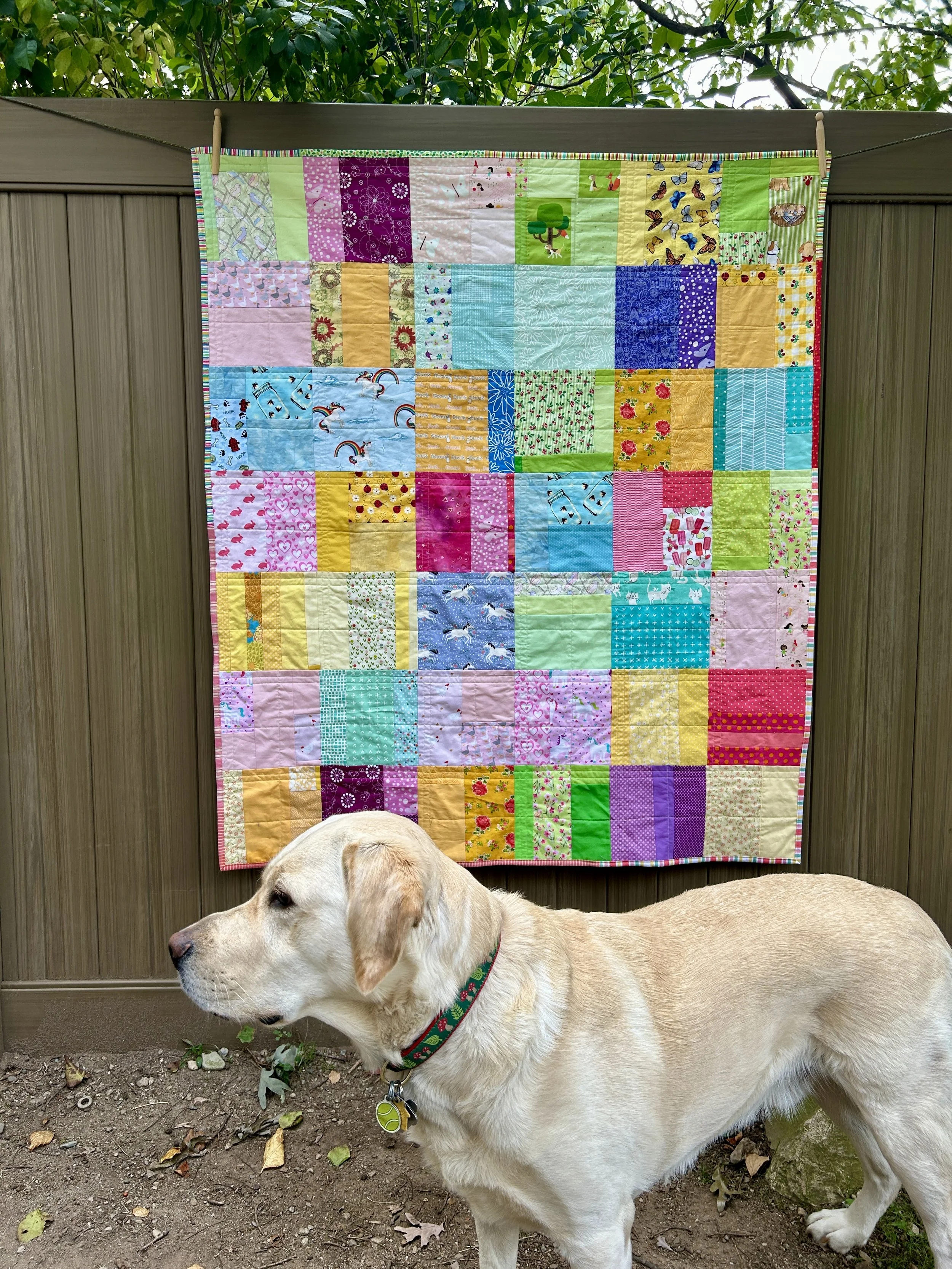
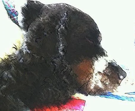
Somebody else spied my quilt as well. He does like to be included in quilt displays but isn’t so keen on facing the camera! Fortunately he has a great profile!