 |
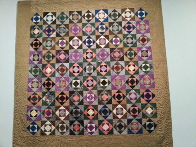
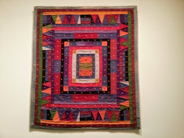
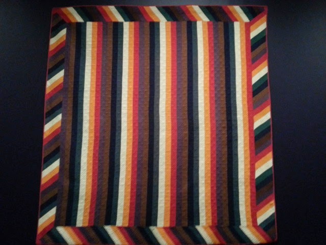
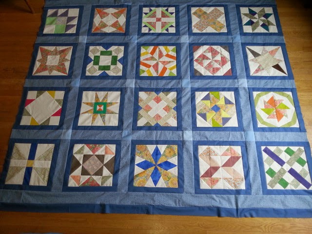
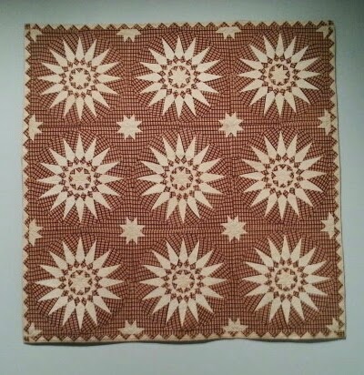
| Touching Sunbursts, Pennsylvania 1854 |
Last night I had the privilege of hearing Gerald Roy, one of the 2 gentlemen who collected the quilts in at the Museum of Fine Arts, Boston, "Quilts and Color" show, speak about the collection and about color in quilts.
He told us a bit of the back story about the show. They started talking about putting part of the Pilgrim/Roy quilt collection on exhibit at the MFA 5 years ago. He credits the MFA's director, Malcolm Rogers, and the young museum staff with making this show possible. The museum has some quilts in their collection, mostly gifts from people, but he said no one at the museum in the past was particularly interested in them.
Roy said Malcolm Rogers came to his home to discuss the possibility of a quilt show at the MFA. Before Roy would show Rogers any of his quilts, he had Rogers do some piecing and appliqué so he would better understand what he was looking at! Once Rogers had done some sewing, THEN Roy showed him some of his collection!
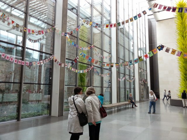
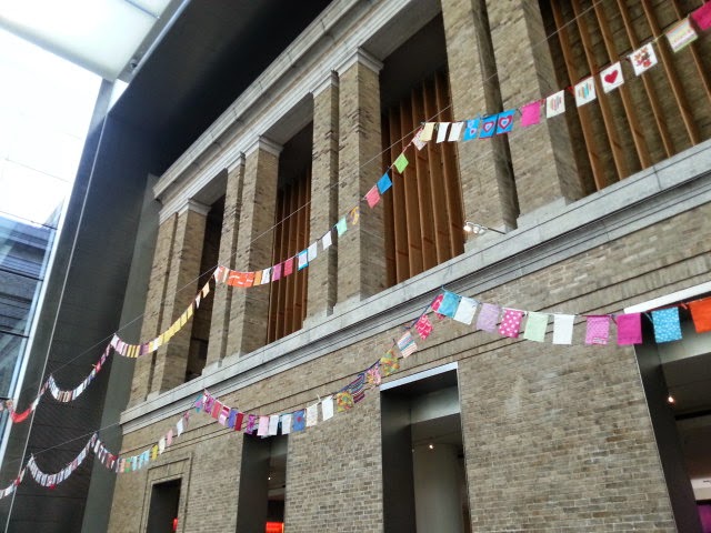
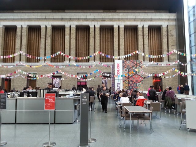
It took 100 people to get this show set up--Roy counted the carpenters as well as the curators! He said everyone wore white gloves AND white coats and they all treated the quilts with utmost care.
The walls in each room were painted colors chosen to best show off the quilts being displayed. White walls are not a good choice for a quilt show. It took 6 light engineers to get the lighting right. The lights had to illuminate the quilts but there couldn't be any hot spots which could damage the quilts. He commented that it is important to let your eyes adjust to the lighting in the galleries when you first enter. That's really true in my experience.
Some of the quilts are mounted on wooden frames which are padded with batting and muslin. The quilts are sewn onto the frame, with stitches every 6 inches across the quilts to keep them flat and taut without stretching them. Roy commented that it is not great for the quilts but it does show them beautifully. He added that the quilts are coming off the frames as soon as the show closes!
After the talk, my friend Janet and I went back to the exhibit to look at it again. It was almost 9 PM and there were very few people in the gallery. It was amazing to be there without a crowd. If you can get there at night, do it!
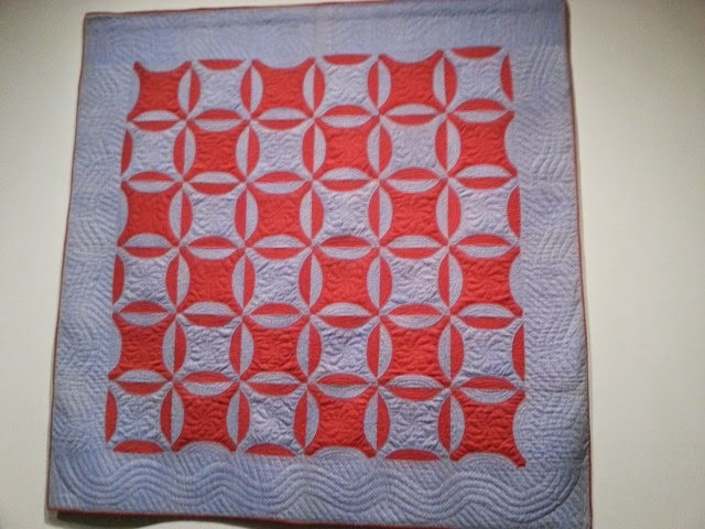
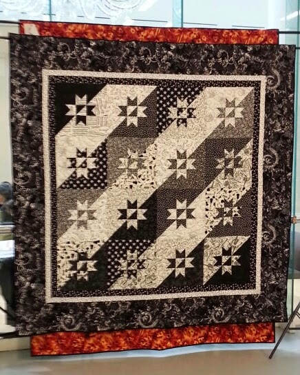
I discovered I missed a whole room on my first visit. Yikes! It was the section with all the appliqué quilts. This room was labelled quilts with "Contrast." Here is a Mariner's Compass made in Massachusetts in1840. It's 20 years before the Civil War but the brown and cream fabric looks much like the Civil War reproduction fabrics currently available. I think this quilt would have also been happy in the room of quilts with Vibration, except those quilts vibrate due to color and this one vibrates because of the plaid.
 |
| Mariner's Compass |
It was so quiet in the gallery last night that a one of the MFA guards came up and said "You have to come look at this quilt!" She led us to the yellow and white basket quilt made in New York in the 1920's-1930s in the "Mixtures" room.
Yes indeed! We knew it well and also why she wanted us to see it. This basket quilt is creating quite a buzz among the show's visitors. If you stand right in front of the quilt, it does look yellow and white for a the most part. But move to the right or left and you notice the white looks more like a light grey.
Did the quilt's maker run out of fabric and needed to substitute something different to complete the quilt?
Roy had just finished telling us about this quilt. No, they believe the white is all the same fabric.
However, it is a cotton sateen (also known as cotton satin). Ordinary plain woven cotton has a flat weave--the threads all run up and down or straight across. In a sateen, the thread also has a diagonal weave. How the light strikes that diagonal weave determines how the fabric looks.
Notice how differently the fabric appears depending on where you are standing. Fascinating! We had fun expelling to the Museum guard why she was seeing the variation in the fabric's color. That doesn't happen every day!
In his talk last evening, Roy, showed us a photo of the backing on this quilt. It is light purple, yellow's complement in the color wheel. This delighted him no end!! That is a detail you have to be told because you won't be able to see the backs of any of the quilts.
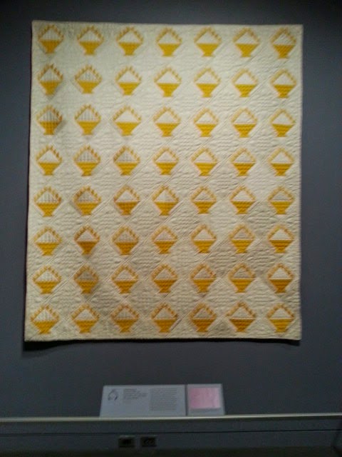 |
| Basket Quilt, Front Facing |
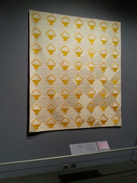 |
| From the left side |
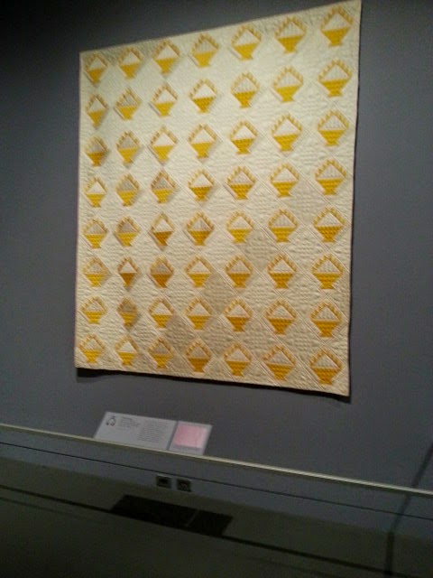 |
| From the right side |
One of the attendees at the lecture asked Roy what he thought about the Modern Quilt Movement.
He stopped to see if the audience knew what was being asked. He asked who in the room were quilters. It turned out almost everyone! So he continued. He thought the Modern Quilt Movement was great. New people have started quilting which he said is always a good thing, the experimentation is great….and folks are buying lots of fabric!
One last comment from Gerald Roy:
He said a pieced top is only a pieced top. "It isn't a quilt, until it is quilted."
Those of you with a stack of UFOs….take note!
I'll share some his thoughts on color in another post.