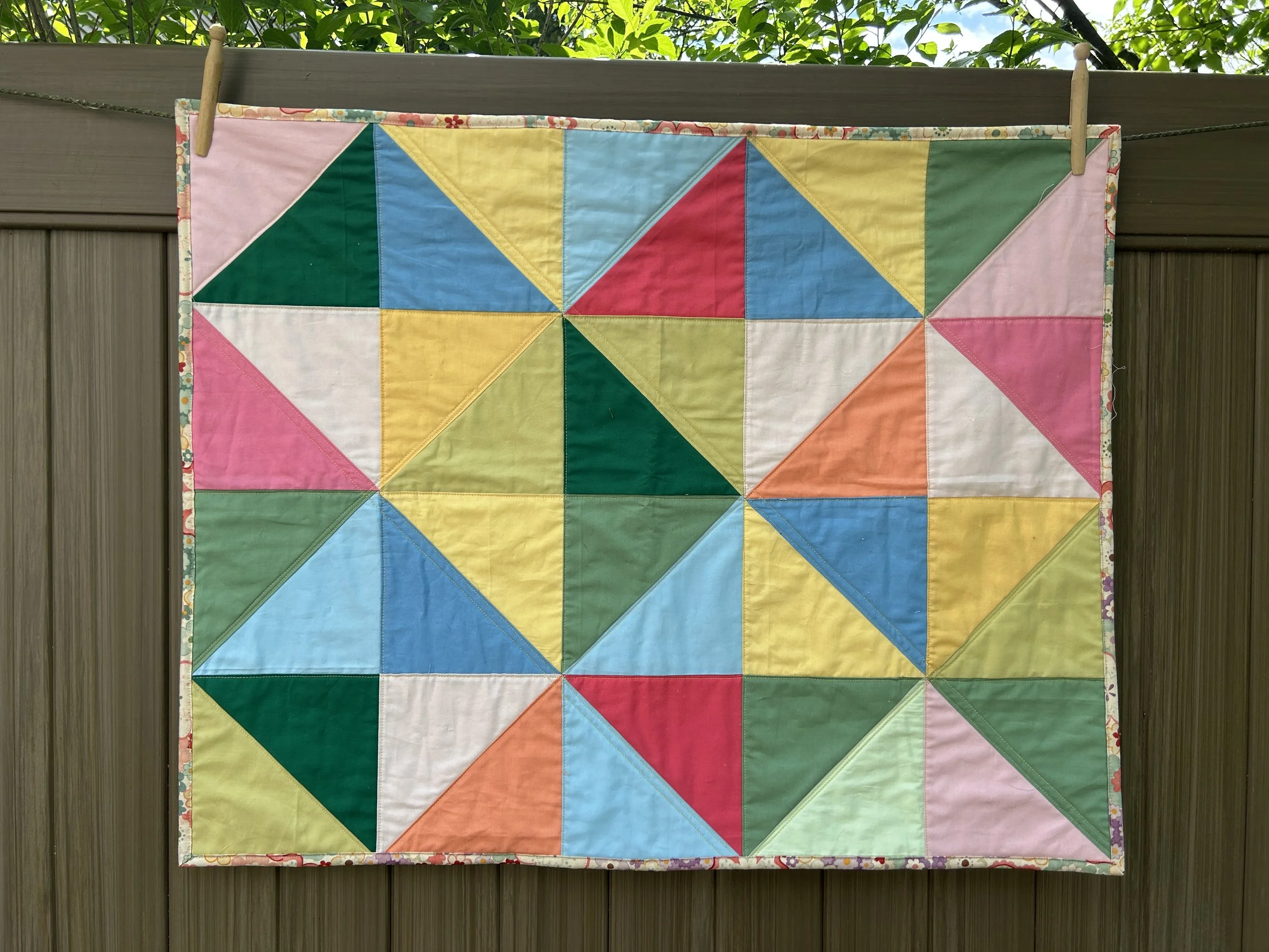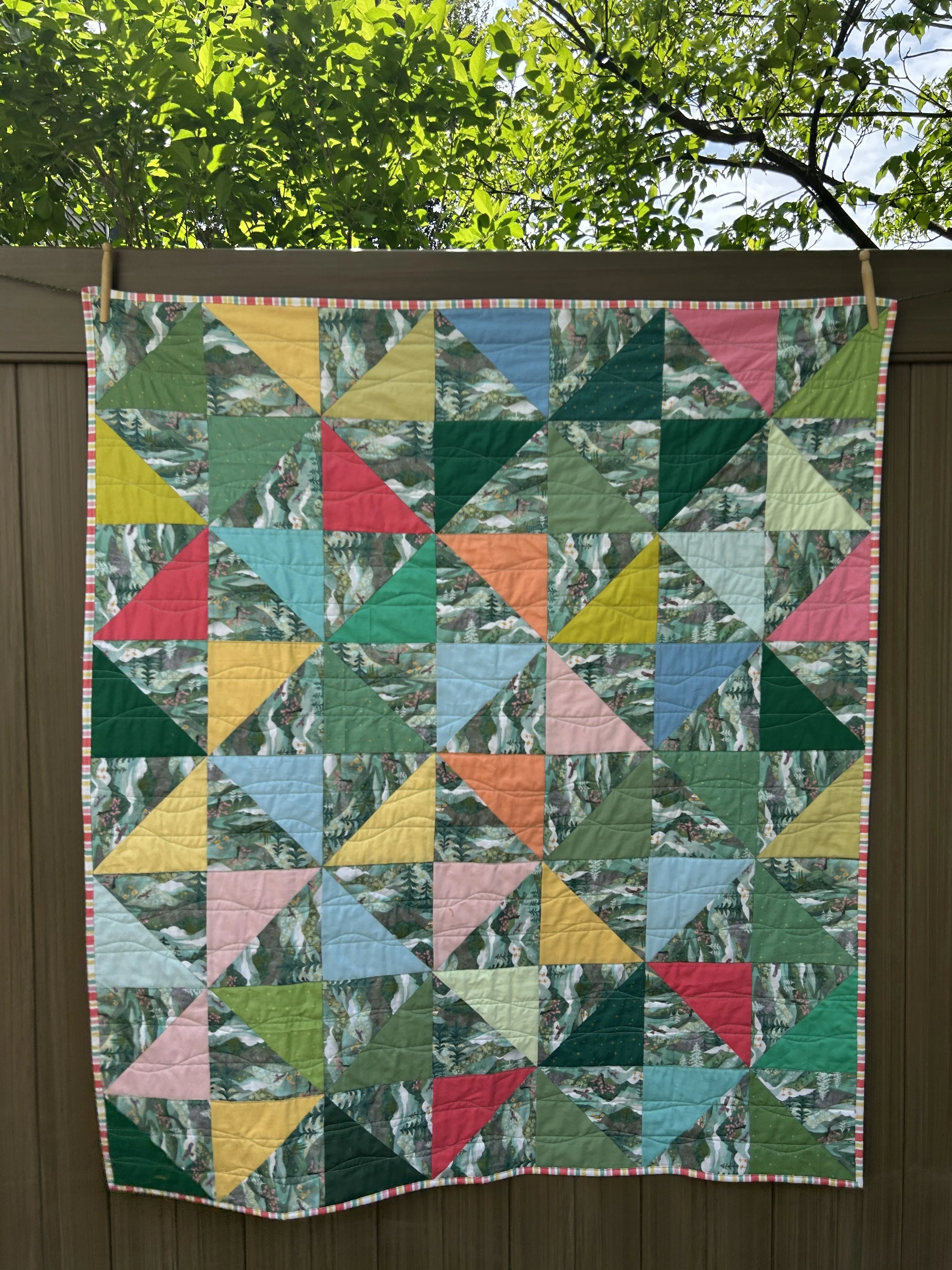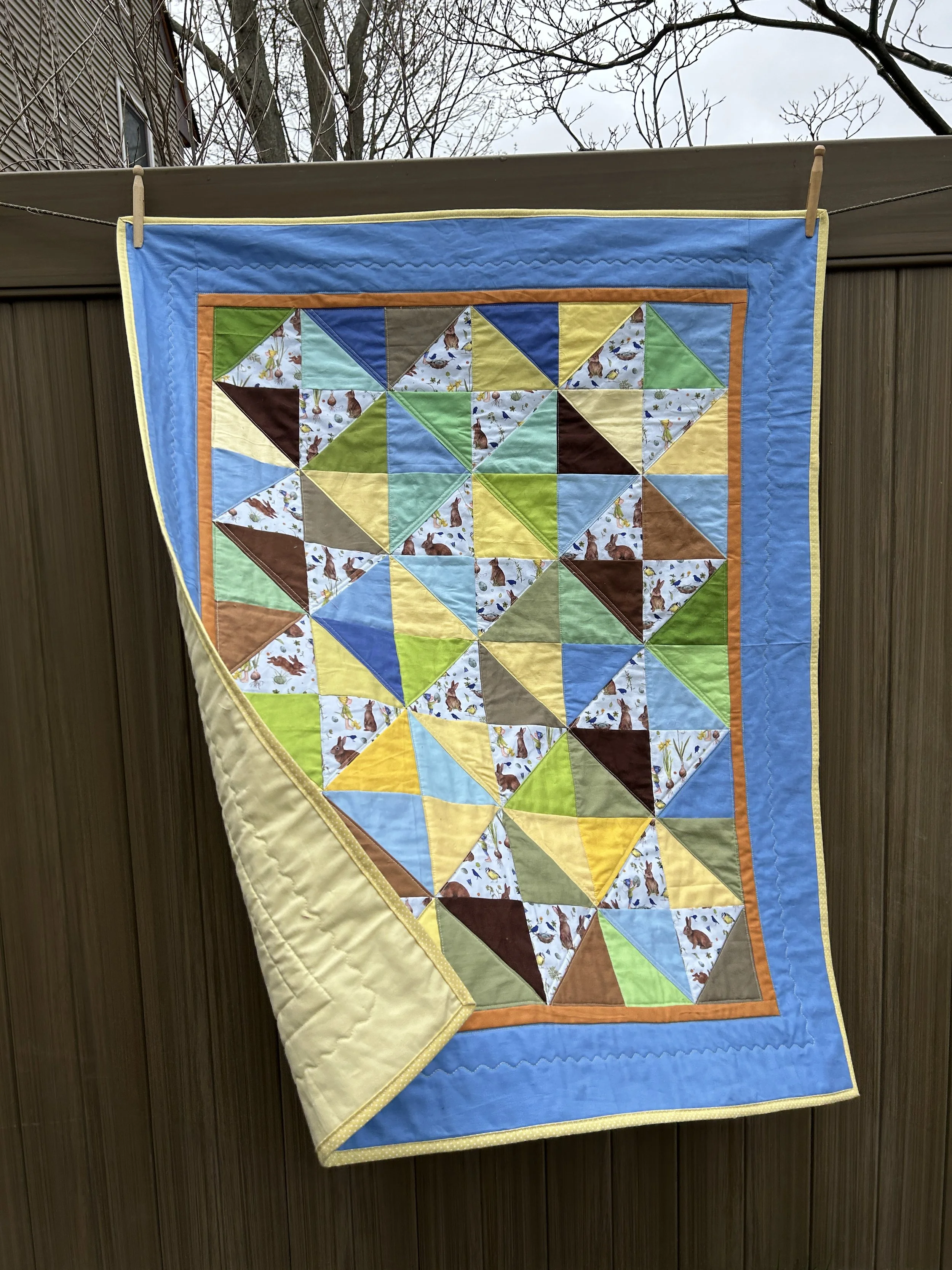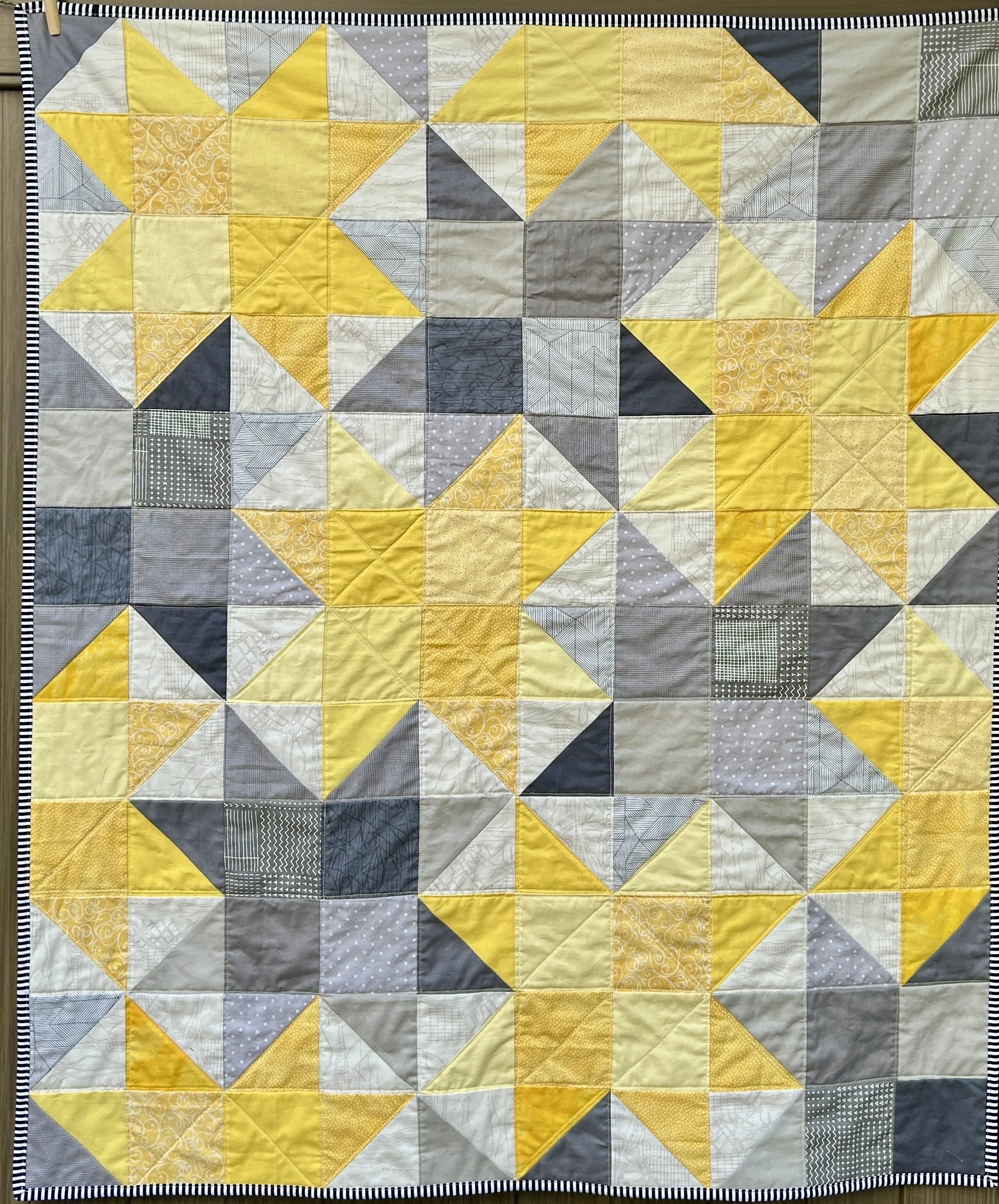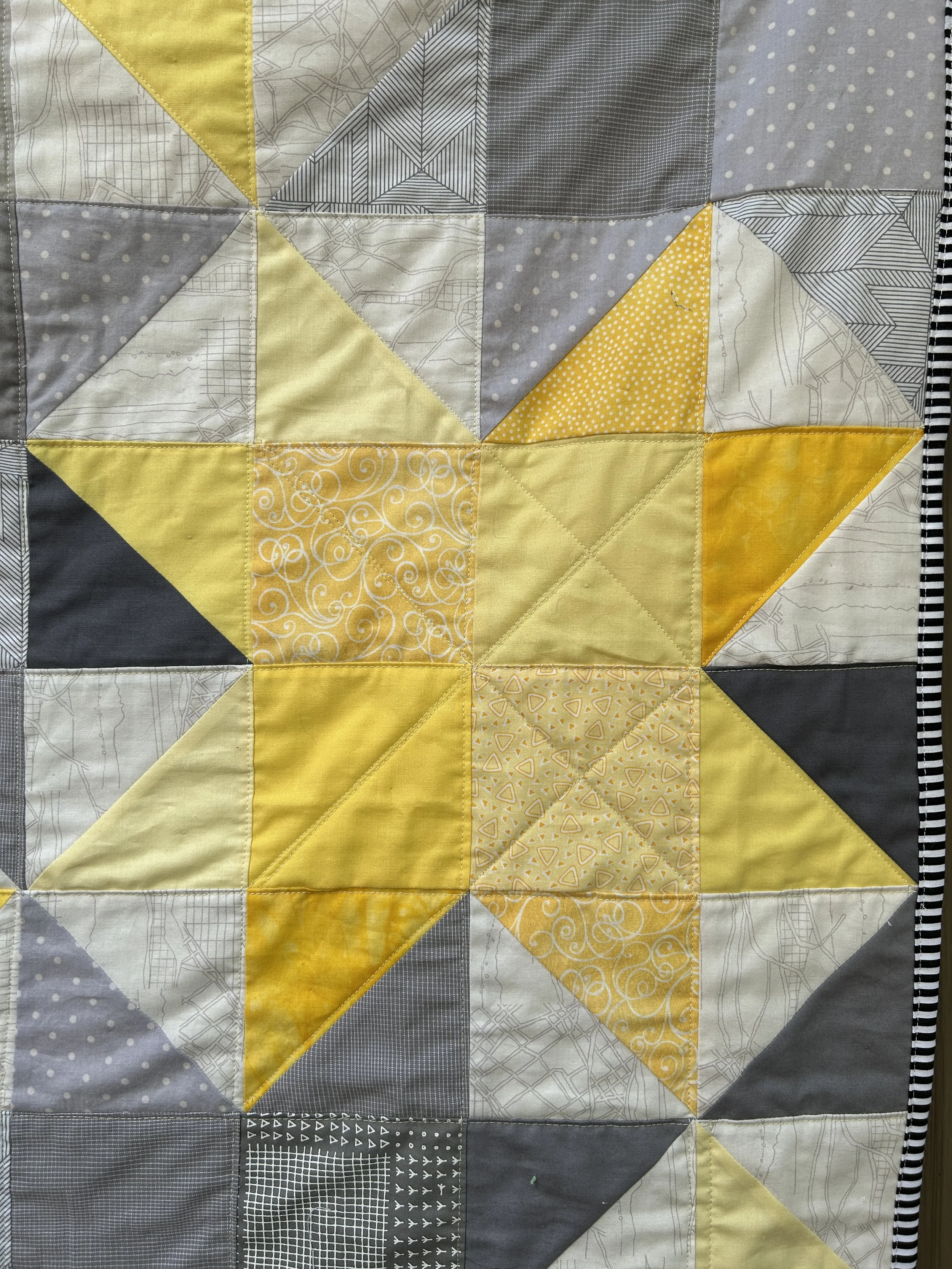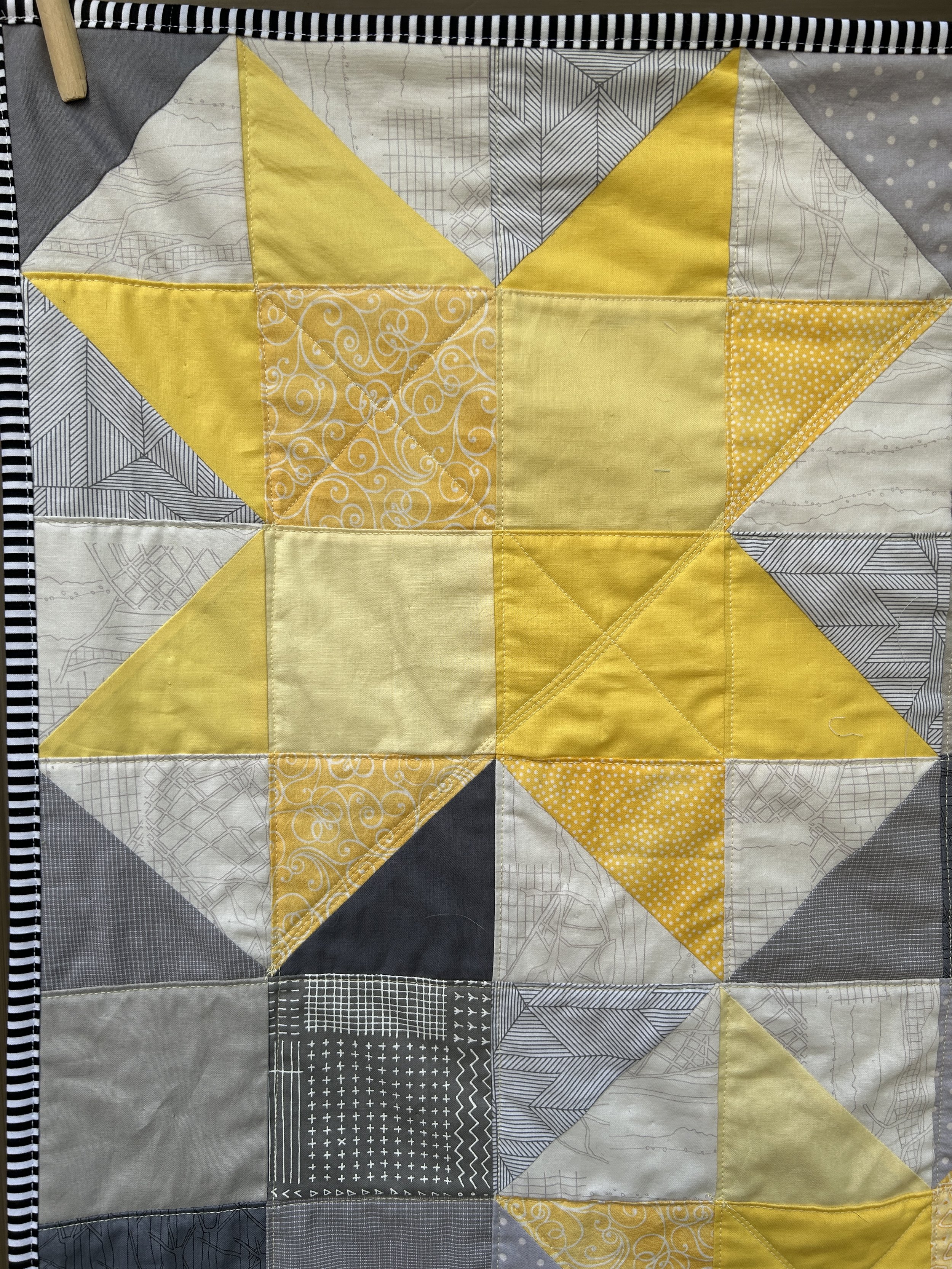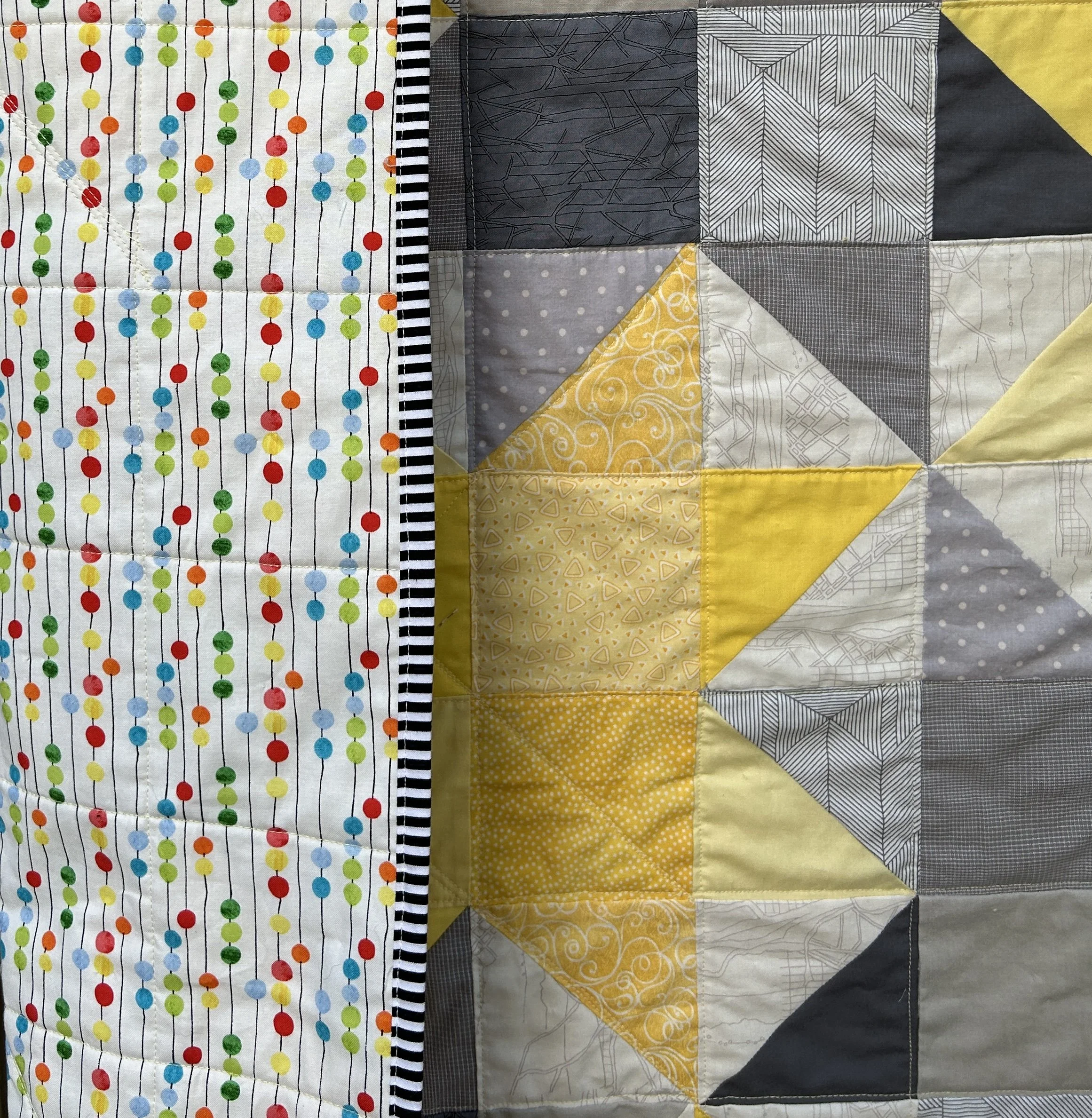
Deciding On A Layout for a Slab Quilt

by Judy Tucker


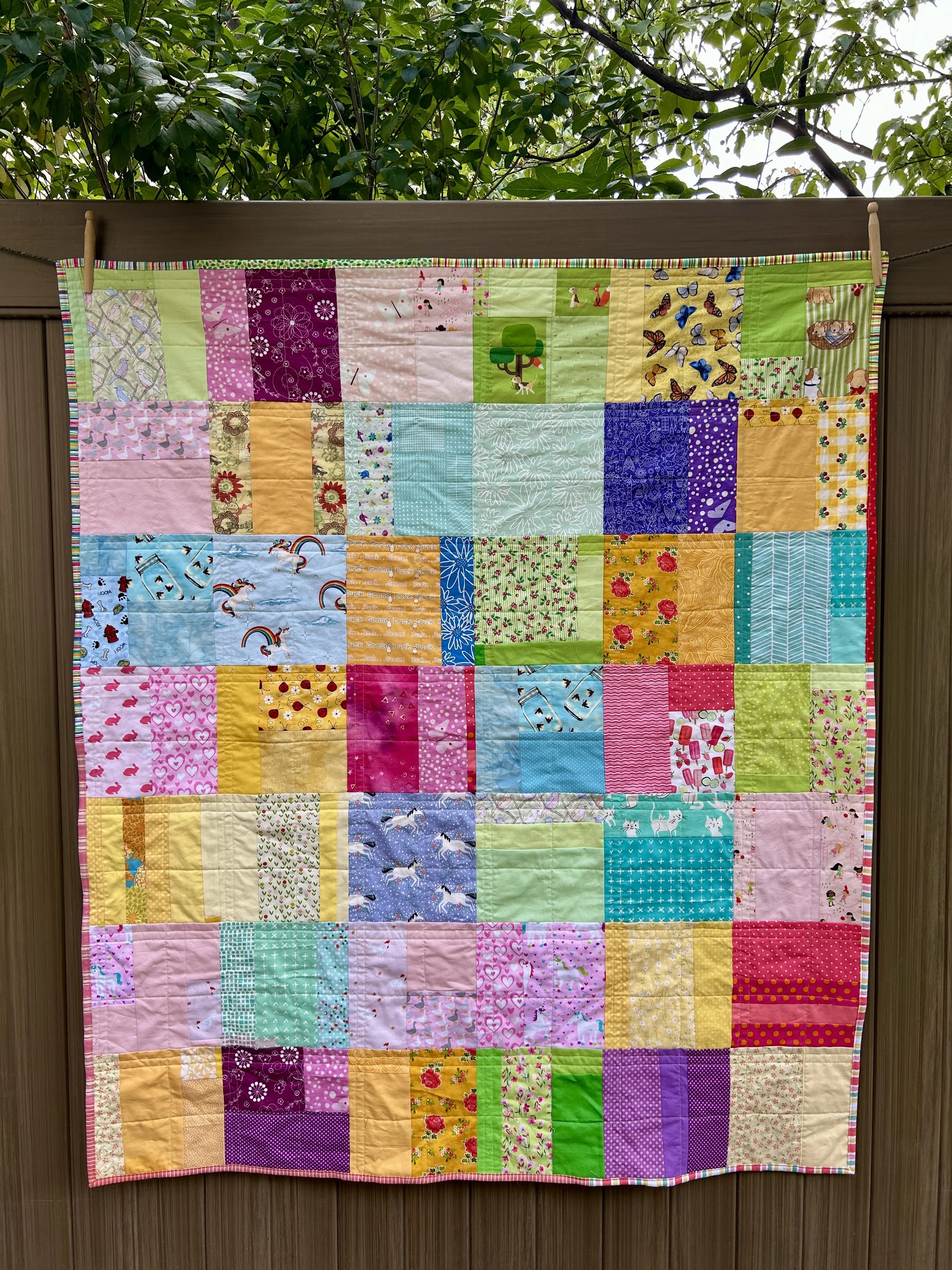
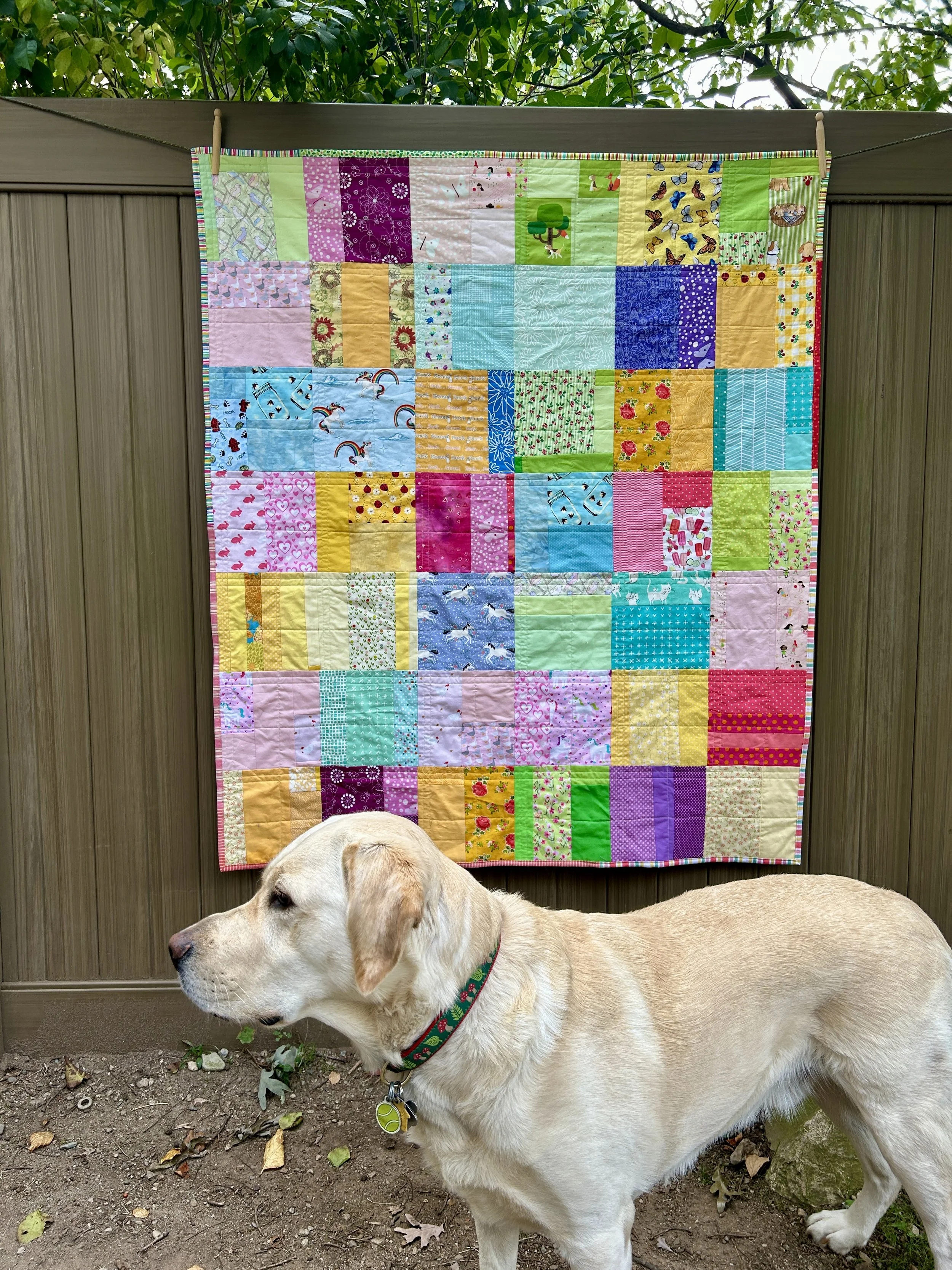
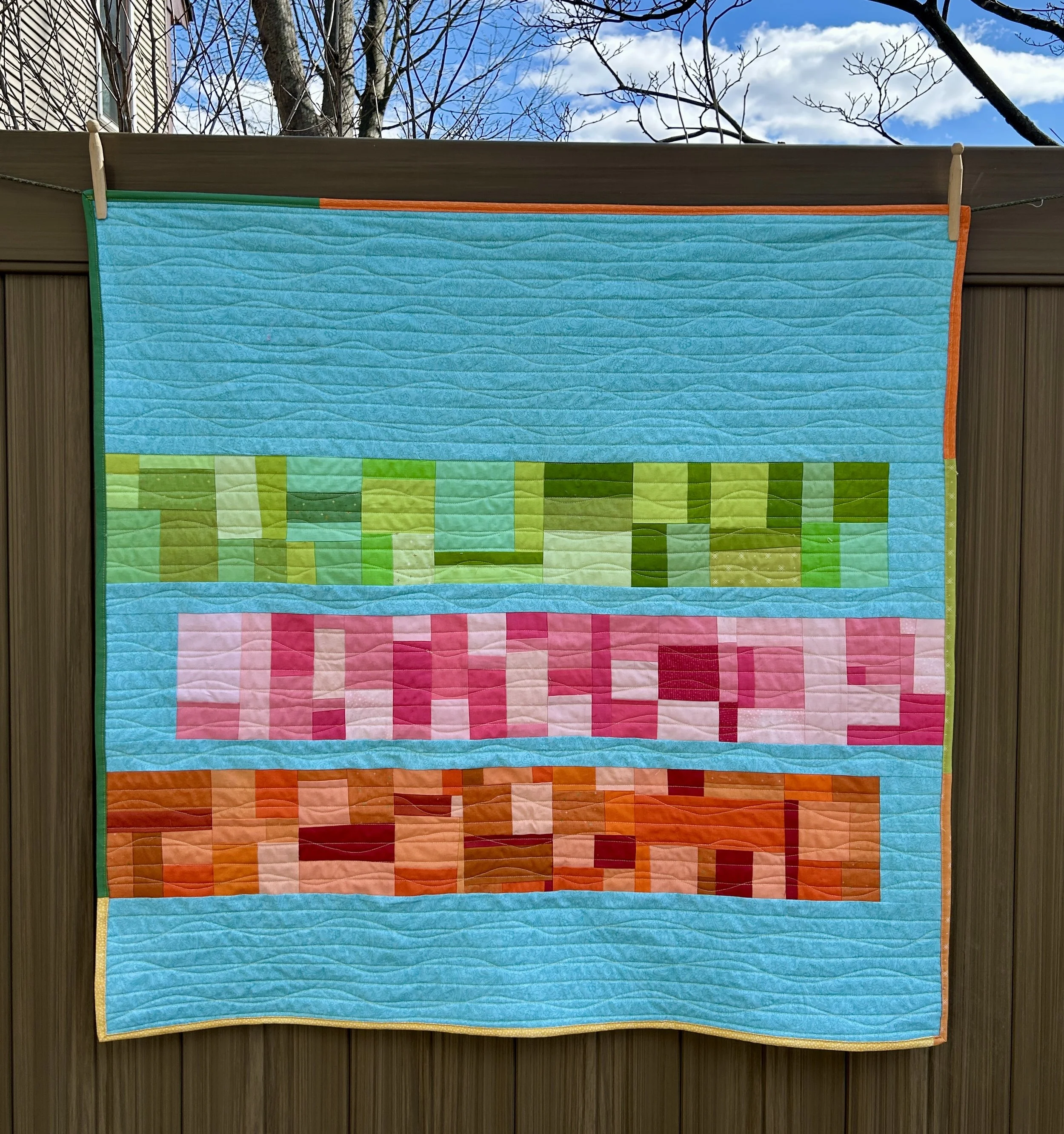
In my last post I discussed finding a stack of fabrics in a color way which I really liked. While I was looking forward to fabric shopping, I discovered that if I were willing to add some prints, I had exactly what I needed in my stash!

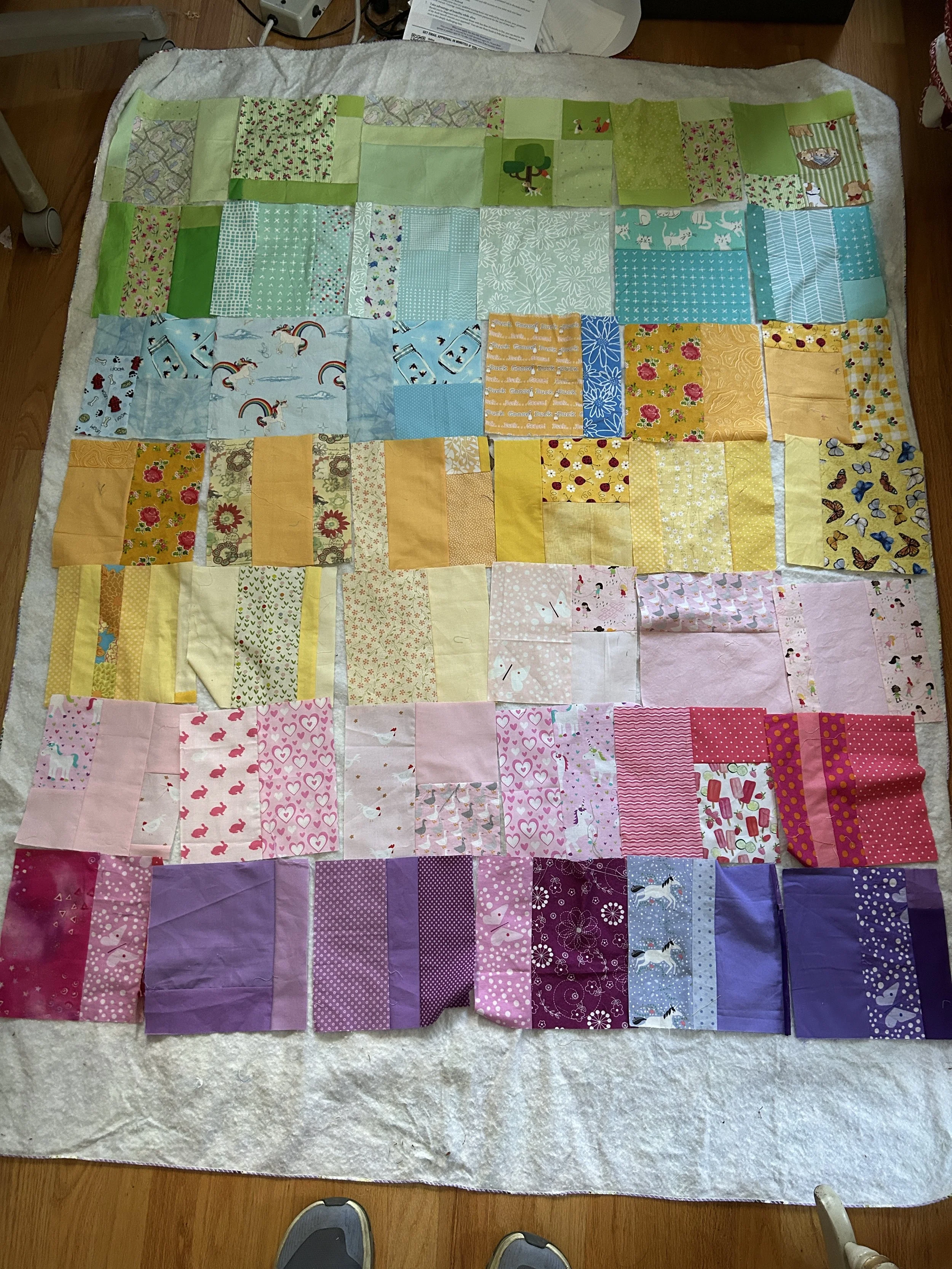
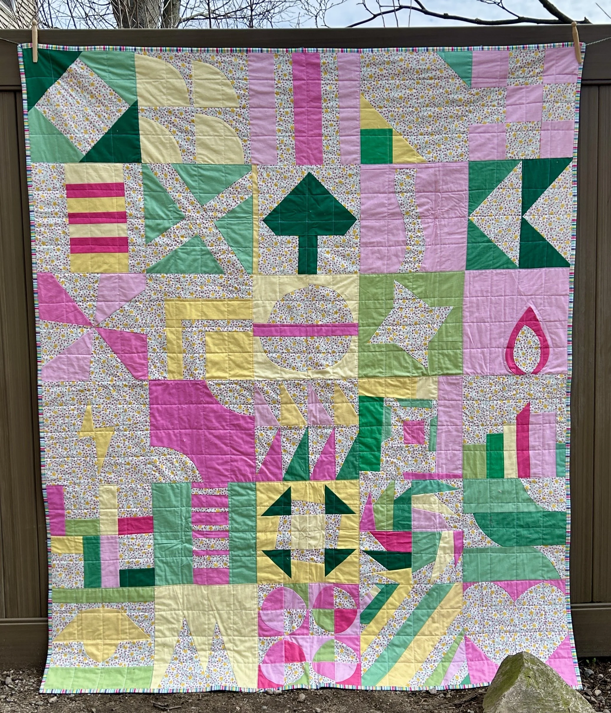
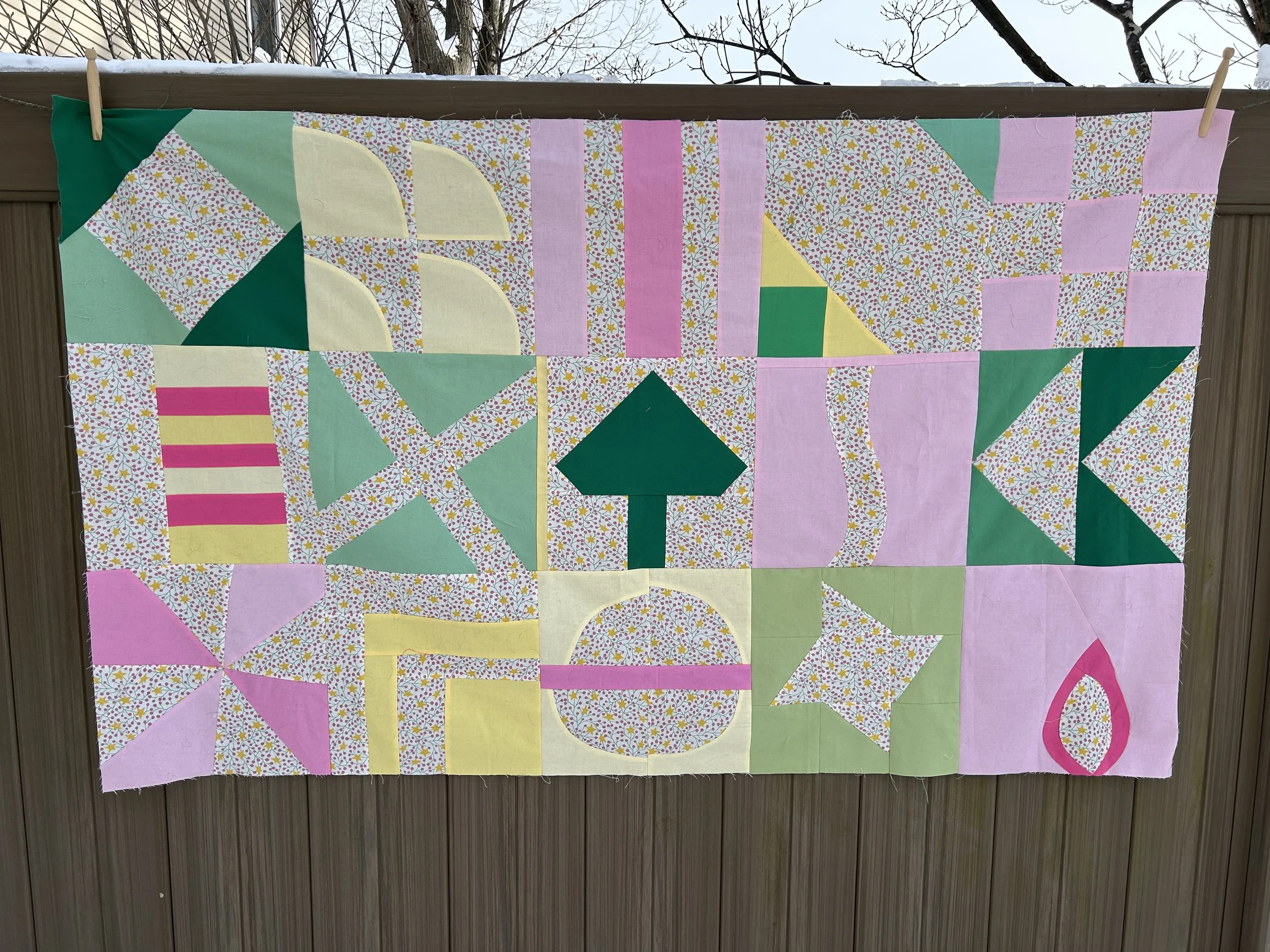
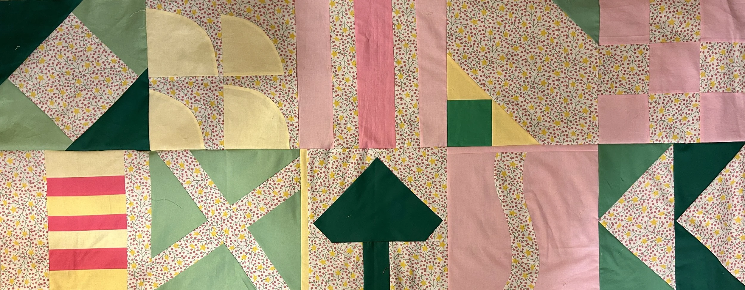
The blocks are simple slabs: 8 inches square, unfinished. Slabs are typically 12.5 inches square, unfinished. But my stash is looking rather scrappy these days, and I found lots of 8 inch pieces. 12.5 would have been a struggle! So smaller blocks it is!

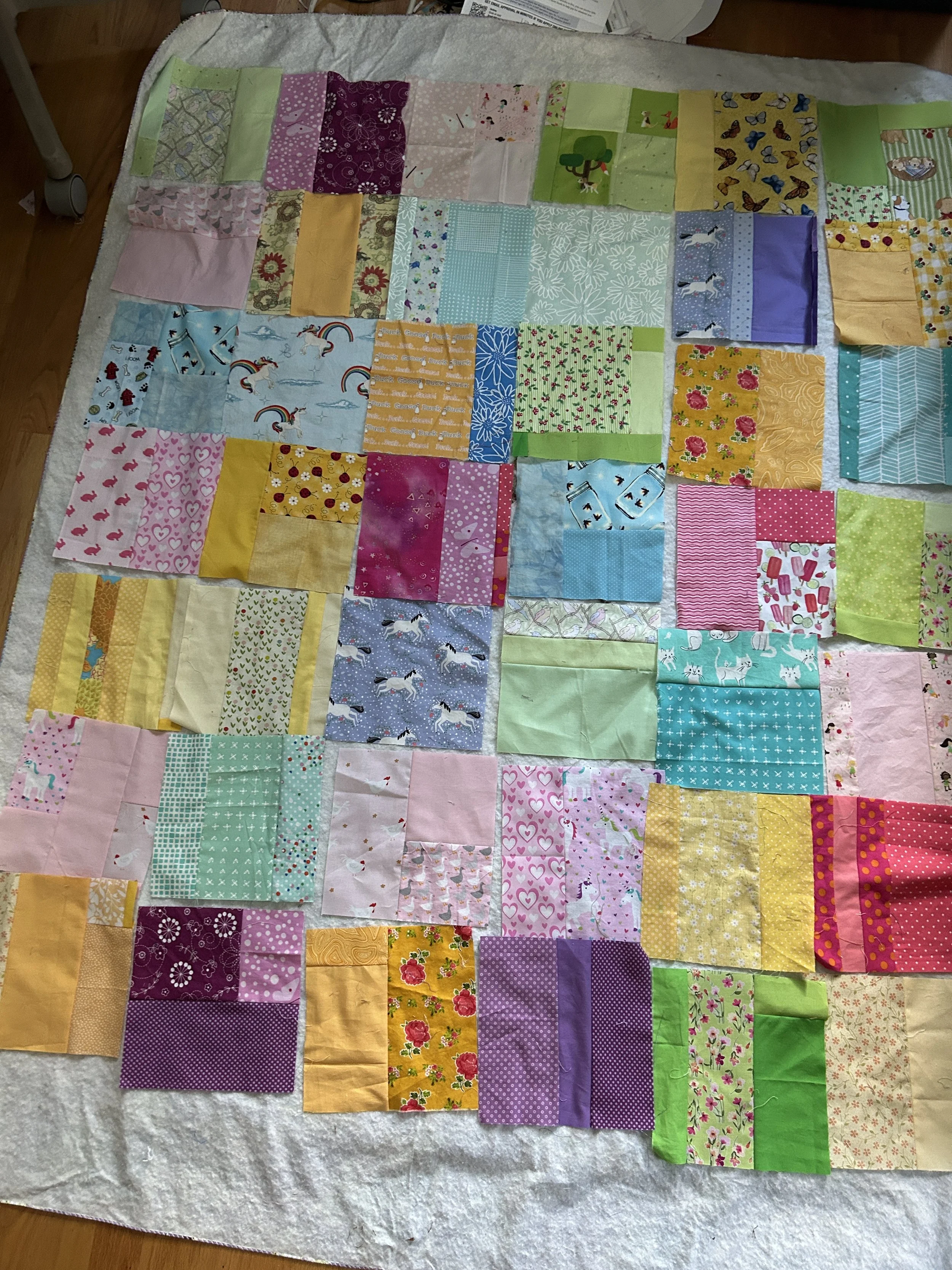
In my previous post, you can see my attempts to draw out the colors of the stack of fabric I fell in love with online. Looking at the quilt layout on the left hand side above, you can see the the colors which were in the fabric stack. A bright green, a pastel green, a school bus yellow, a lemon yellow, a light pink, bright pink (my addition), a magenta, a dusty purple and a dark purple. The set also had red and maroon in it, but that didn’t make a lot of sense to me. By I the time I had made the purple blocks, I already had 2 more blocks than I needed. So I was relieved to be able to leave out the reds!

While I like the gradient flow of the layout on the left, I find the jumbled colors in the layout on the right much more exciting. I looks to me like a pastel madras print.

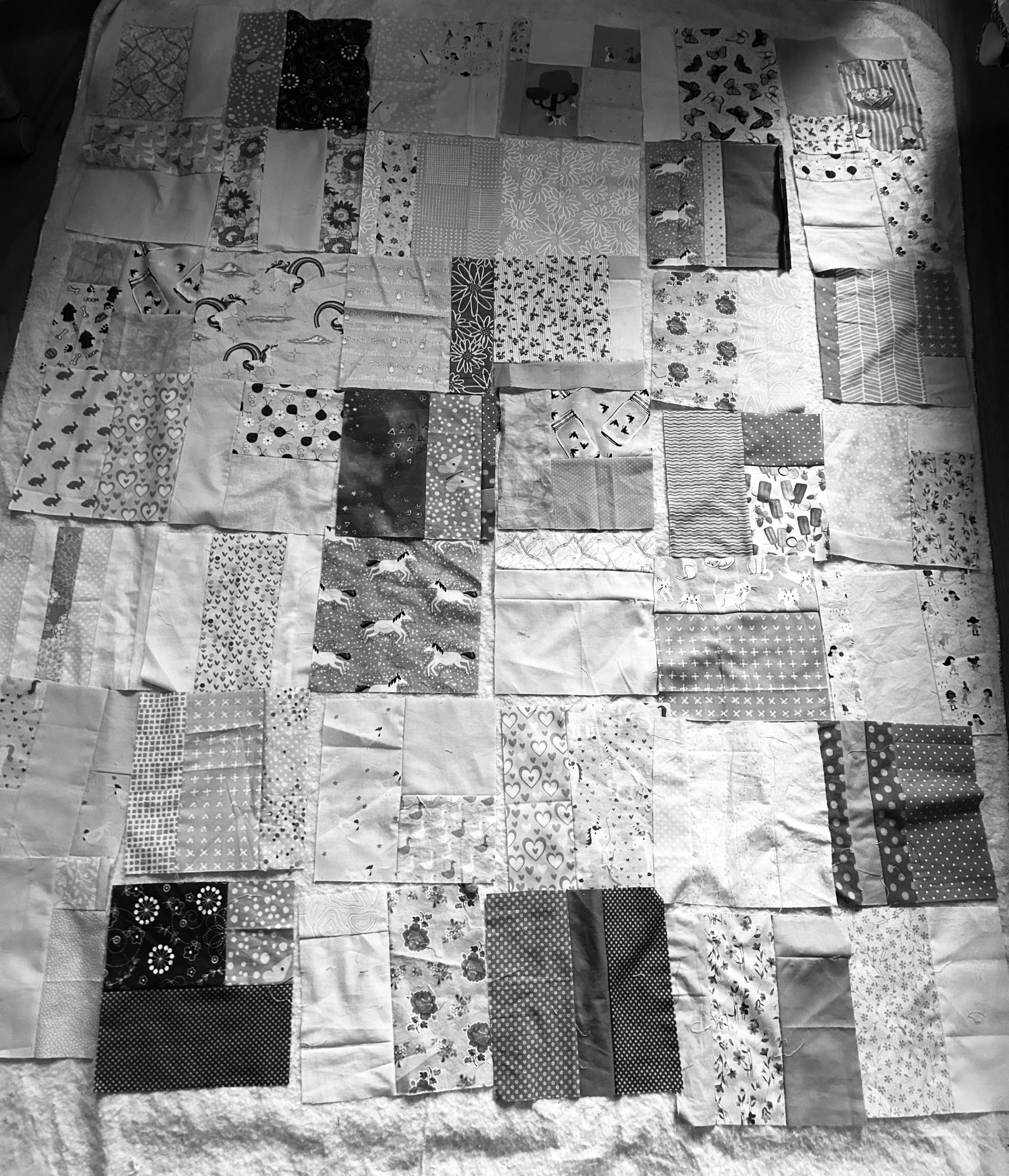
I had one more thing to check before settling on a layout. Where the bolder colors scattered evenly through the quilt? I thought they were, but there is an easy way to check.

Take a photo of the layout, and then change the colors to grey scale. The more saturated colors show up beautifully. This layout looks pretty good to me. It might be a bit darker along the bottom, but my quilts tend to be that way, and I don’t think I want more of the intense purples to be up higher in the quilt.

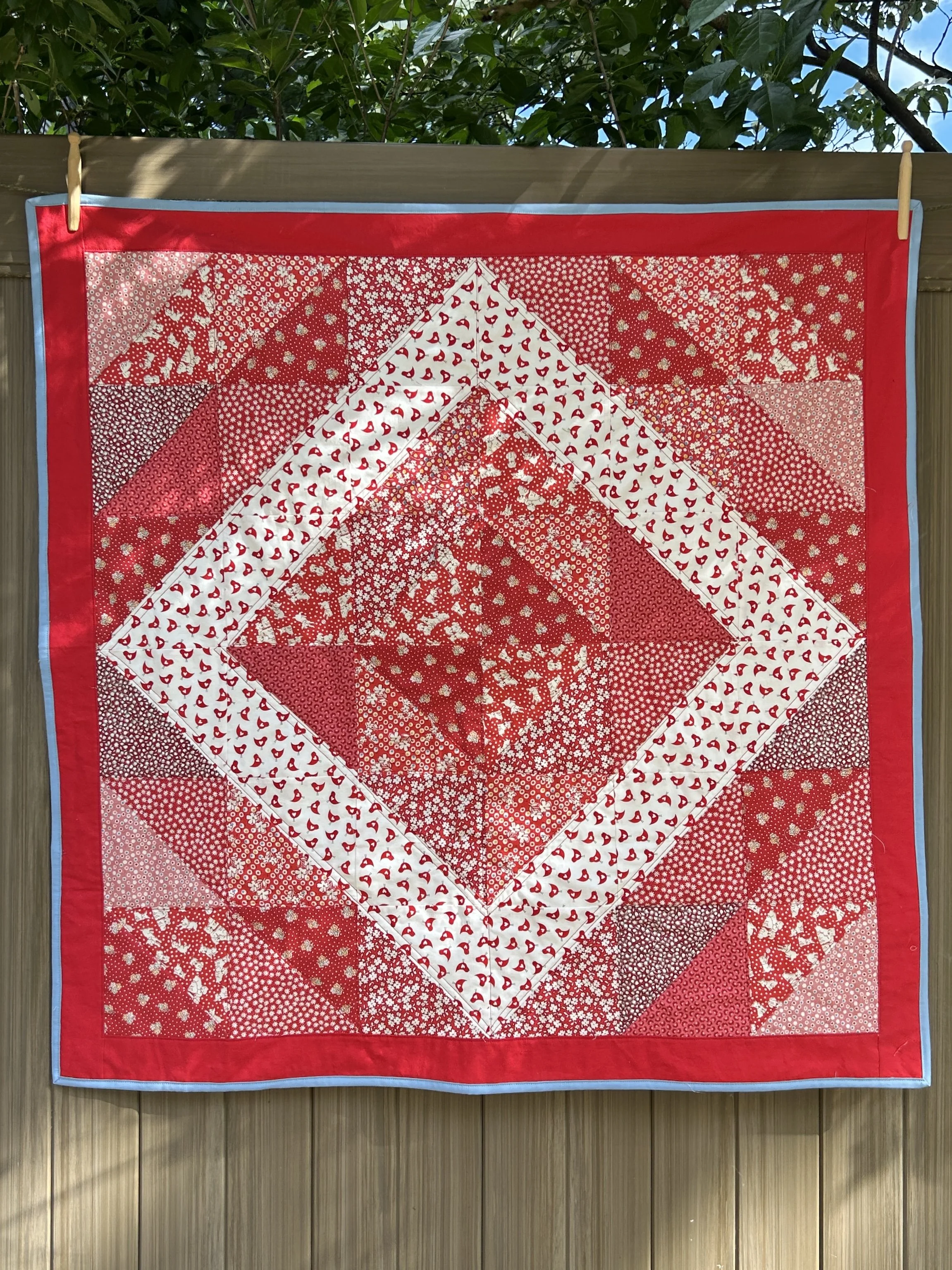
I think I’m ready to sew this lap/baby size quilt together!


Color Way Matches Without Using Fabric

by Judy Tucker


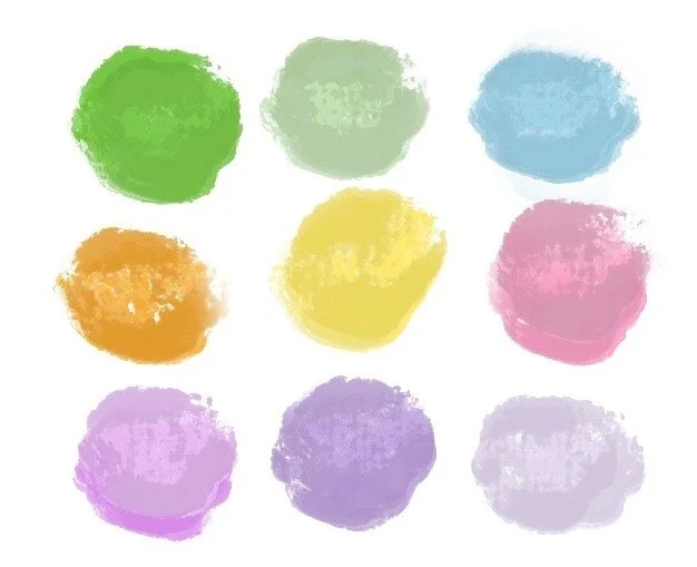
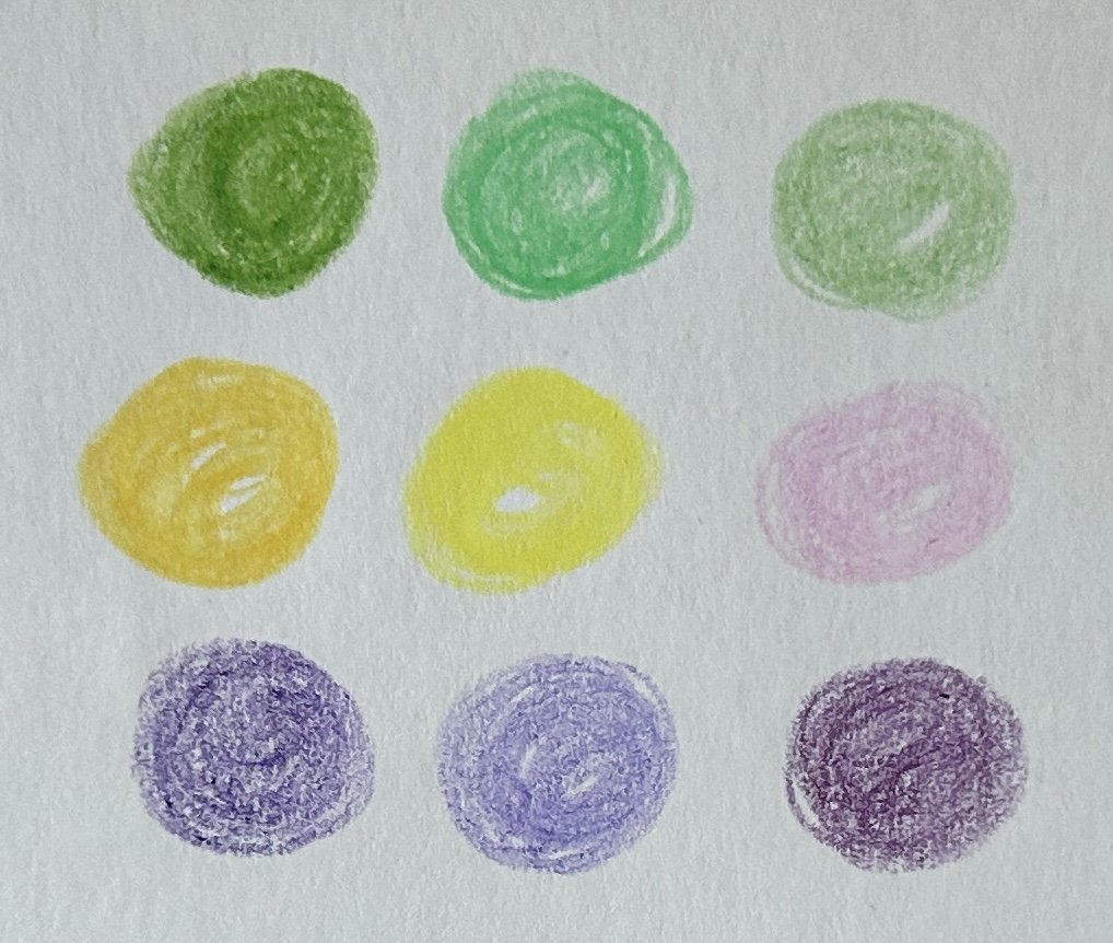
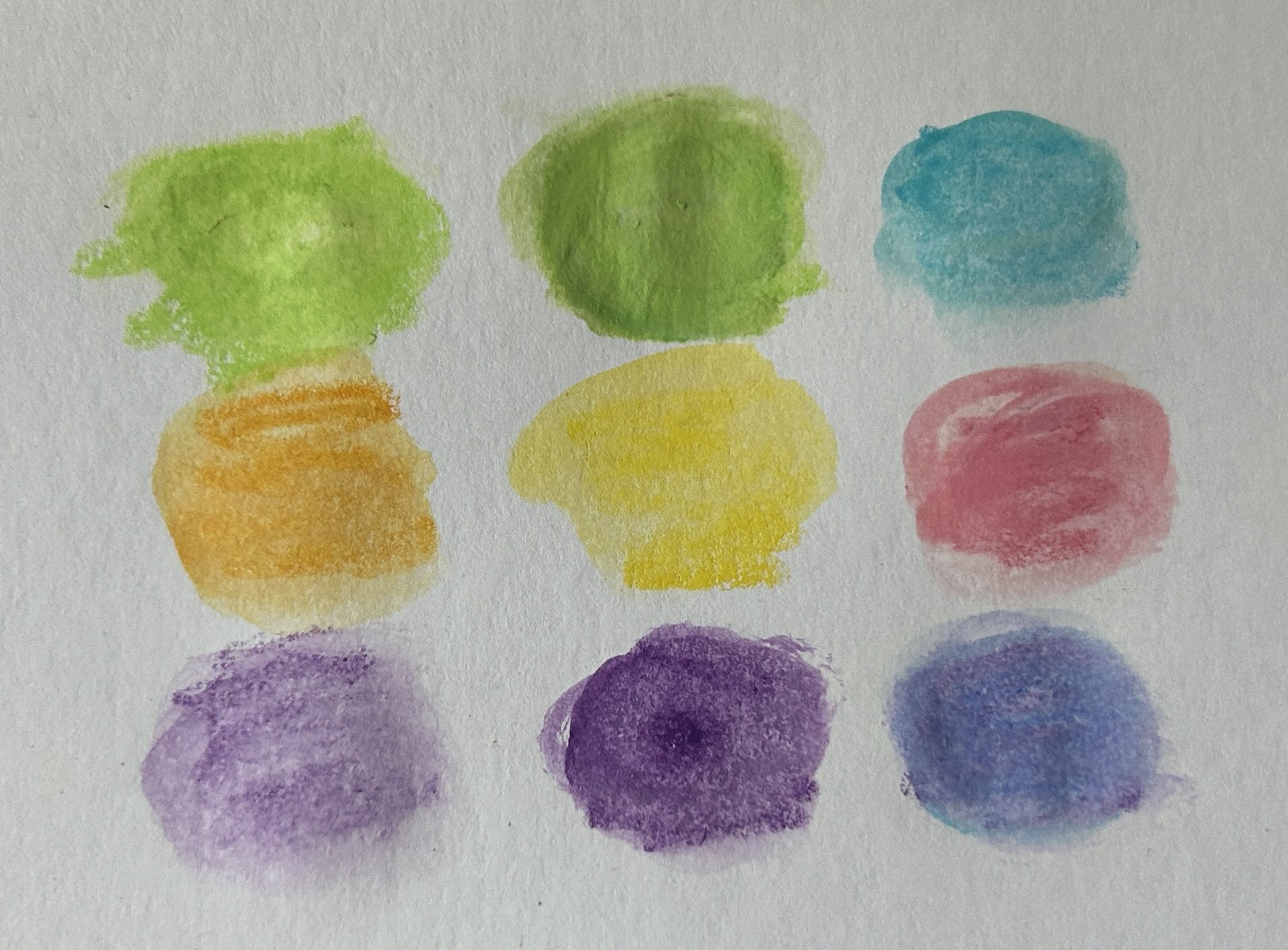
Left to Right: Procreate App, Berol Prismacolor colored pencils, Caran D’Ache Neocolor TM II Aquarelle

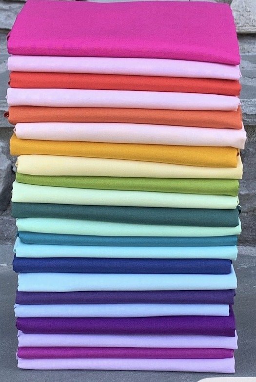
I saw a stack of fabrics which I really liked online. Ready to click the buy button, I read the reviews and discovered they weren’t quilting fabrics. Ready to go shopping, I decided to see what was in the stash first.

If I were willing to add some prints to the solids I had planned on using, I had everything I needed. Just proof that it’s wise to check the stash first if you have one!

I wanted to shared the colors in the color way I fell in love with. But I couldn’t use a photo from online without permission, and I had already put away the fabrics I had used to make this quilt.

So I decided to see what other modalities might do the job. I got close, but paint and dyes are two different beasties, so I knew I was unlikely to get exact matches.

I would have expected to get the best matches with Procreate on my iPad. Maybe I could have if I worked at it longer. But it turns out that the colored pencils did the best job. The two sets of colors in the middle and on the right were drawn on paper, so that’s why the background appears a bit grey. Procreate wins there, as that background is invisible.

A fun exercise which might be useful if I ever wanted an easy way to take some colors to a store to try to find similar colored fabrics to purchase.


My June and July Blocks in the Smithsonian Quilt Along with the National Museum of the American Indian

by Judy Tucker


The National Museum of the American Indian is running a Quilt Along this year as part of the commemoration of the 250th anniversary of the signing of the Declaration of Independence. There are four 10 inch blocks that can be made into a wall hanging. Block patterns are released on the first day of June, July, August and September 2026.

You can read about, and join, this Quilt Along by clicking this Quilt Along Link which will take you to the museum’s website at the Smithsonian.

The blocks follow a historical timeline from the time before settlers arrived, through today, and looking toward the future.

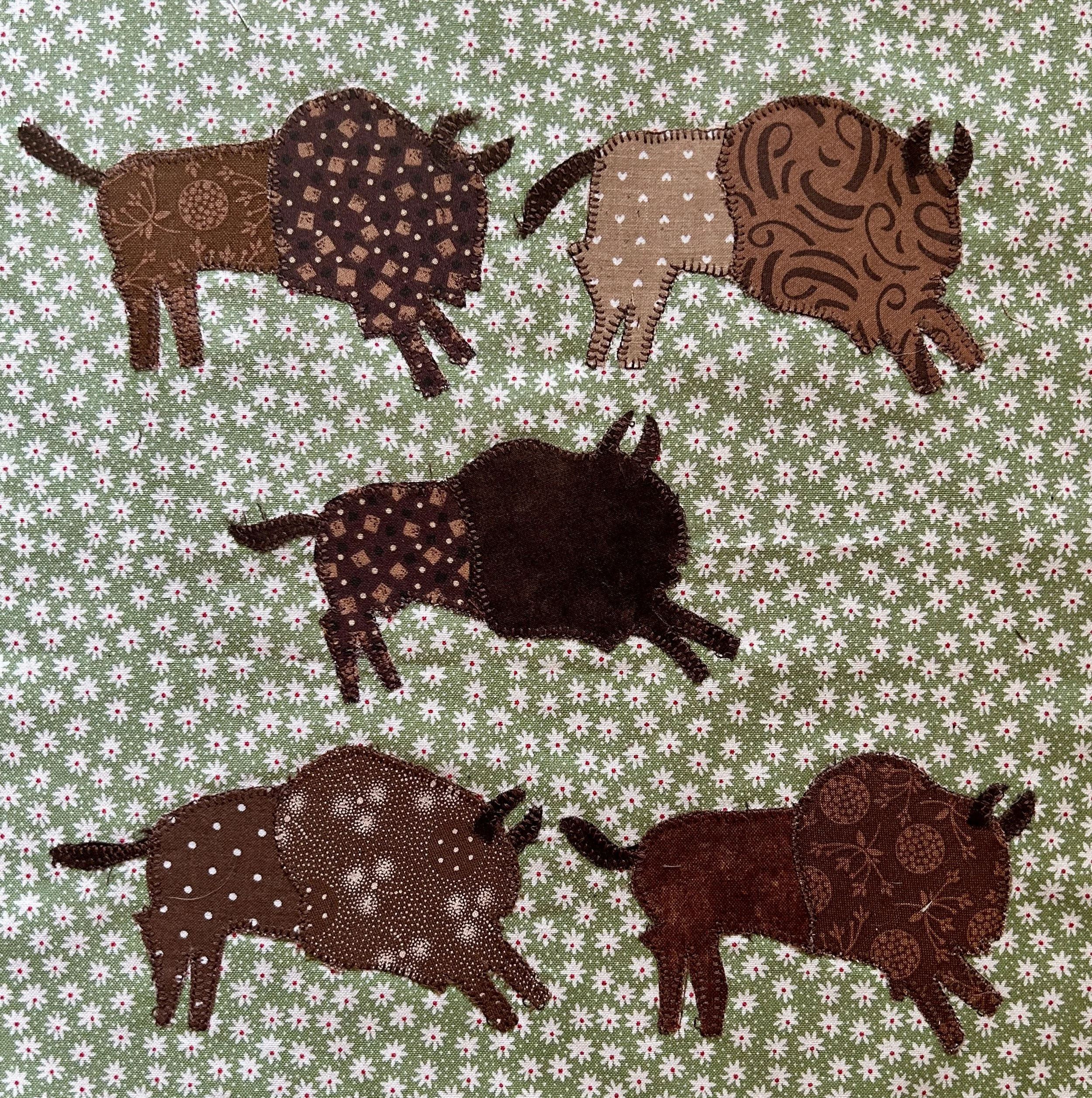
The bison were a fun raw edge appliqué. I made mine with a collection of brown prints and a reproduction 1930s floral which I chose to represent the prairie.

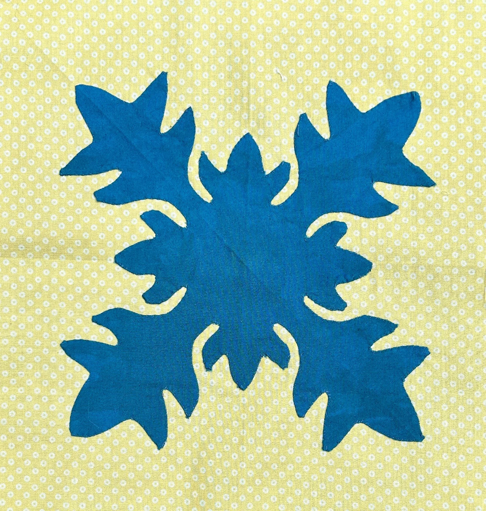
The Hawaiian block is a needle turn applique block. I picked a bright yellow background (warmer and less green in real life) and a purchased hand-dyed piece of fabric with blues and greens I found in my stash. It reminds me of the ocean. I had done some needle turn appliqué in the past, but making a Hawaiian block with its tight curves was a new adventure for me. It took some time, but once I got in a rhythm, it was fun to stitch.
I’m waiting to make all the blocks before I assemble and quilt them. This is a great project. Please sign up and join all the folks across the country doing this sew along. It’s free.