
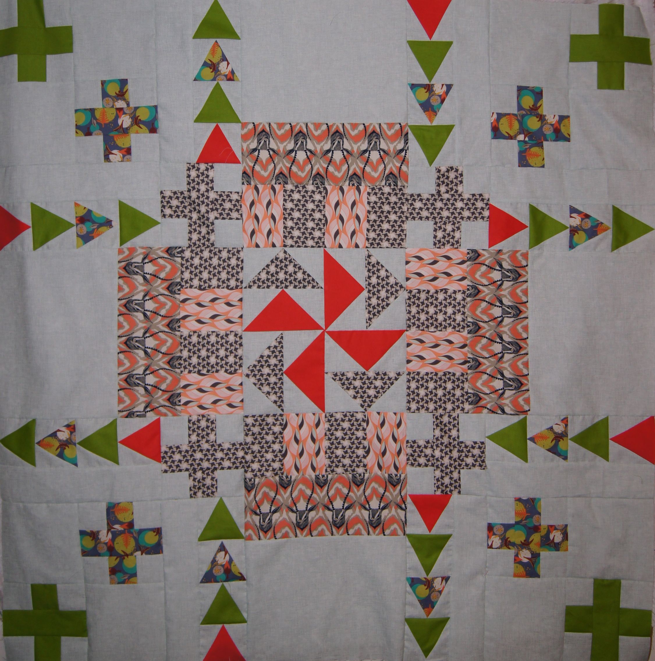
Medallion quilt with gazelle WIP Version 3, partially quilted
This Medallion quilt which I designed on the computer in EQ7 has turned out to be an interesting study in value, contrast and saturation of colors. I like the quilt above…but it's Version 3.
Quick review:
- Value is how dark or light a color is. The closer the color is to looking black, the higher value while pastel is low value.
- Contrast is the difference in value between to colors (or fabrics in our case). A very dark color with a very pastel color or white has high contrast.
- Saturation is the purity of a color. The pure color (the true hue) is vibrant at full saturation, pale at low saturation.
The focus fabric in this quilt is Cotton and Steel Gazelle from Sarah Watts' August collection. The two fabrics I picked out to co-ordinate with that are from Art Gallery's Winged Collection.
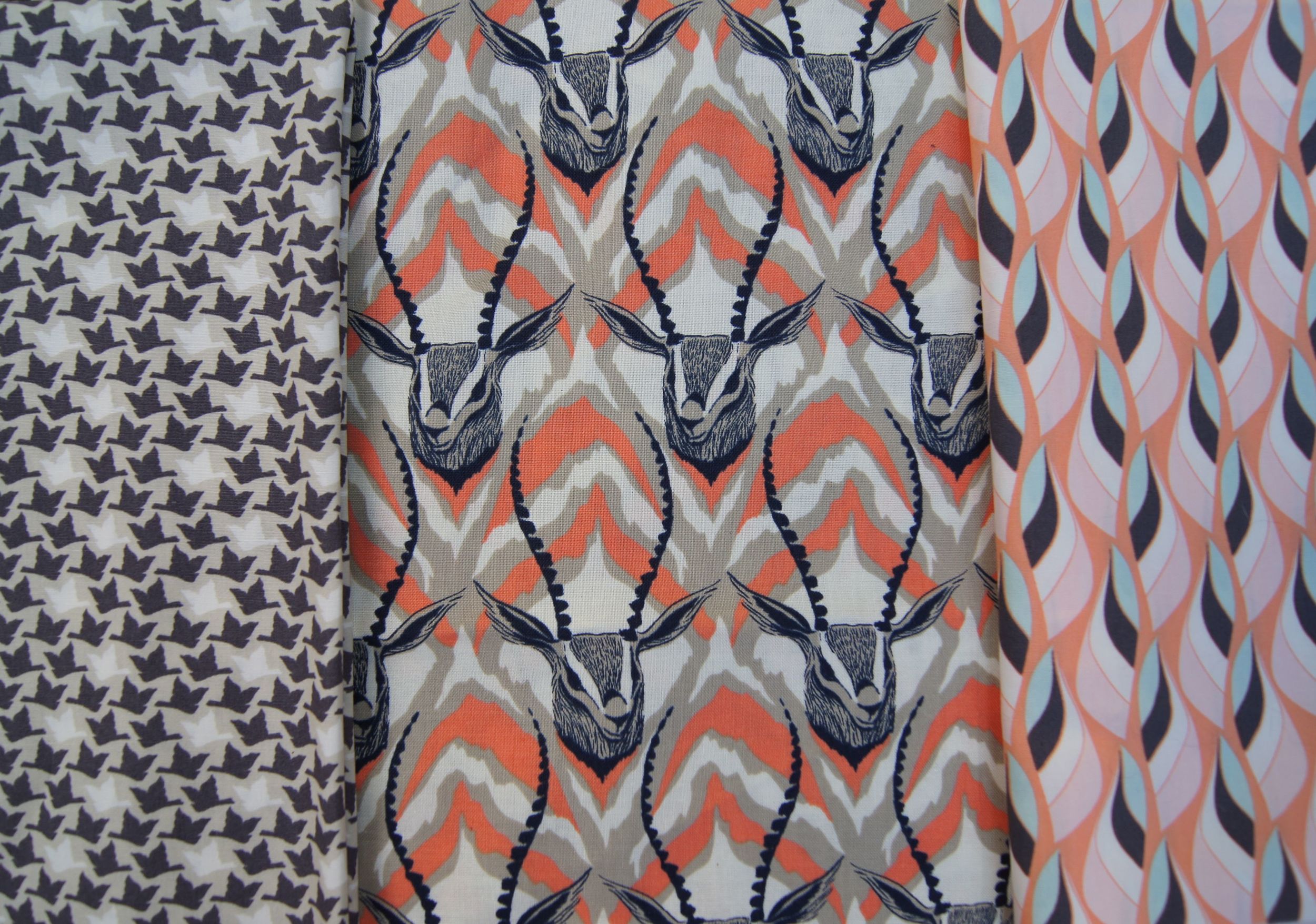
Art Gallery Winged, Cotton and Steel Gazelle, Art Gallery Winged.
As you can see, all three fabrics share shades of brown and two have soft oranges. The contrast among three fabrics is on the low side. They almost blend together.
The background fabric of the quilt is Robert Kaufman's Cotton Linen in Mist which coordinates very well with the aqua in the Winged fabric on the right above.
I added a very high saturation red orange to compliment the soft oranges in the focus fabrics and a high saturation yellow green to go with the green in the final fabric, Rowan's Free Spirit Charleston Farmhouse in the middle crosses.
I knew I needed high contrast in the Dutchman's Puzzle central block, but I thought the low contrast of the blocks around the center medallion was fine. The fabrics looked great together in the store and the pieces looked fine while I sewing the blocks.
And then I put the finished top on the Design Wall to get a good look a it. Here is Version 2.
Medallion quilt with Gazelle Version 2
My immediate thought: the center of the quilt looks like a guy's jacket from the 1940s. It is just dull. What to do?
I wanted to stay with the fabrics I had collected for this quilt. Putting the red orange in the bar blocks was just too close to the central pinwheel and was distracting. My other high contrast, high saturation fabric was the yellow green.
When I auditioned the green in the place of the fabric with the small brown birds I suddenly had a very different quilt. The block with the parallel bars that just looked dull and "same" in Version 2 instantly revealed its asymmetry and movement with the high saturation green. That asymmetry actually seems to give central red orange pinwheel a spin!
The one other thing I might have done differently in this quilt would be to replace the inner crosses with the small brown birds with a solid fabric in the same shade of brown. I think the higher contrast of a solid color cross would add another pop to the quilt.
Here is the computerized pattern with another color way. Seeing the Cotton and Steel Gazelle fabric in the store changed my original plan!
There is moderate contrast in the bar block in this design but there is not a high enough contrast between the 2 blues to create the visual movement from the asymmetry.

Medallion Quilt Designed in EQ7 Version 1
I have to say this project really surprised me. I thought Version 2 with the fabrics was fine until I saw it all together. But this quilt pattern really needs the contrast to make it shine.
Designing is a fascinating process!