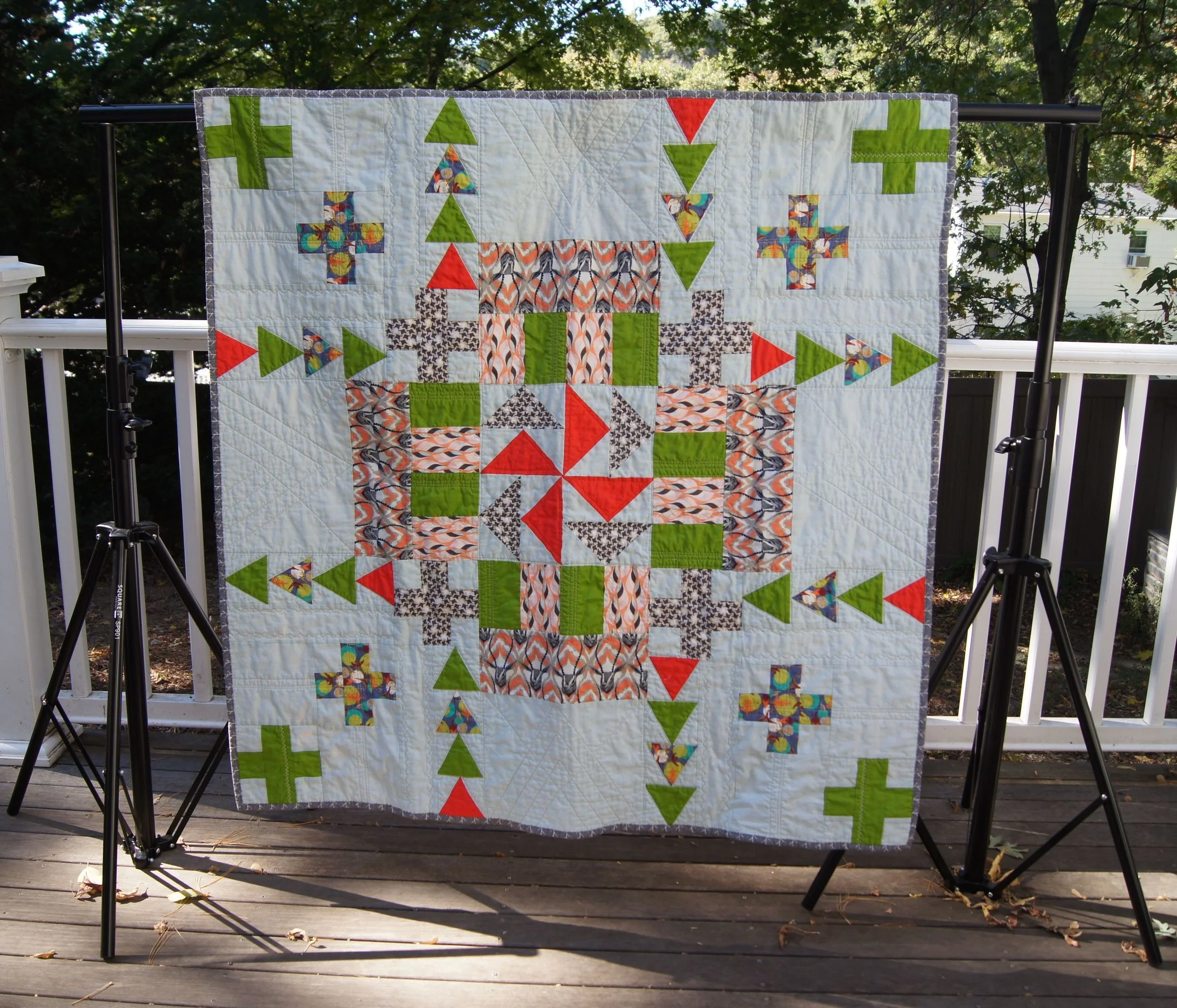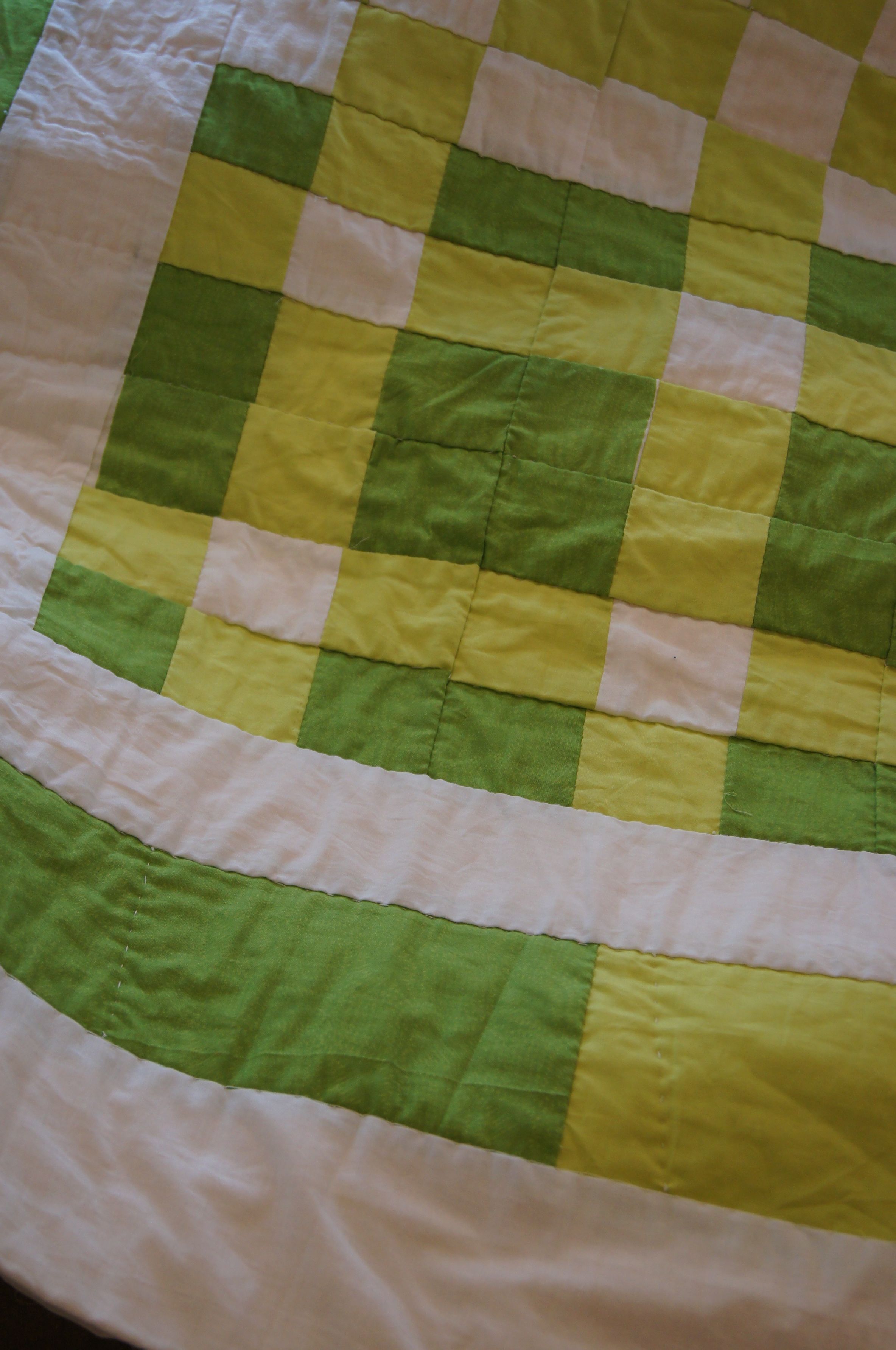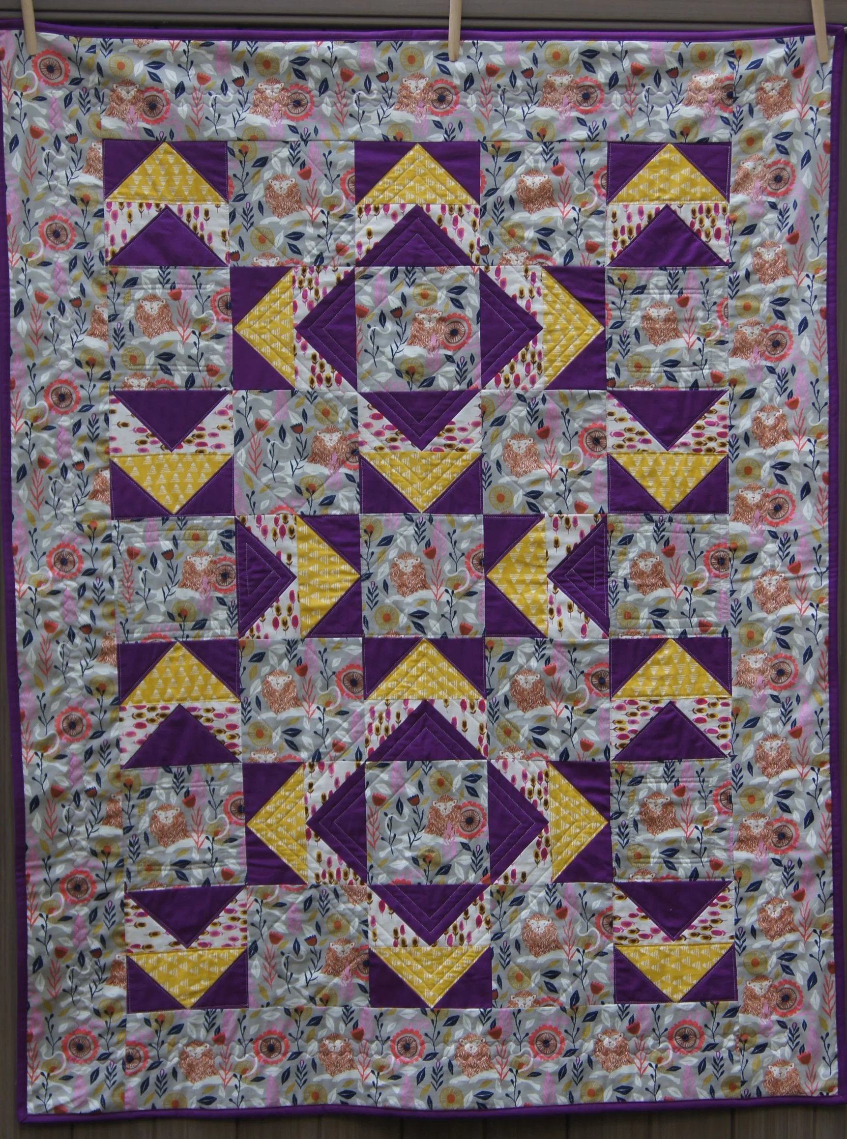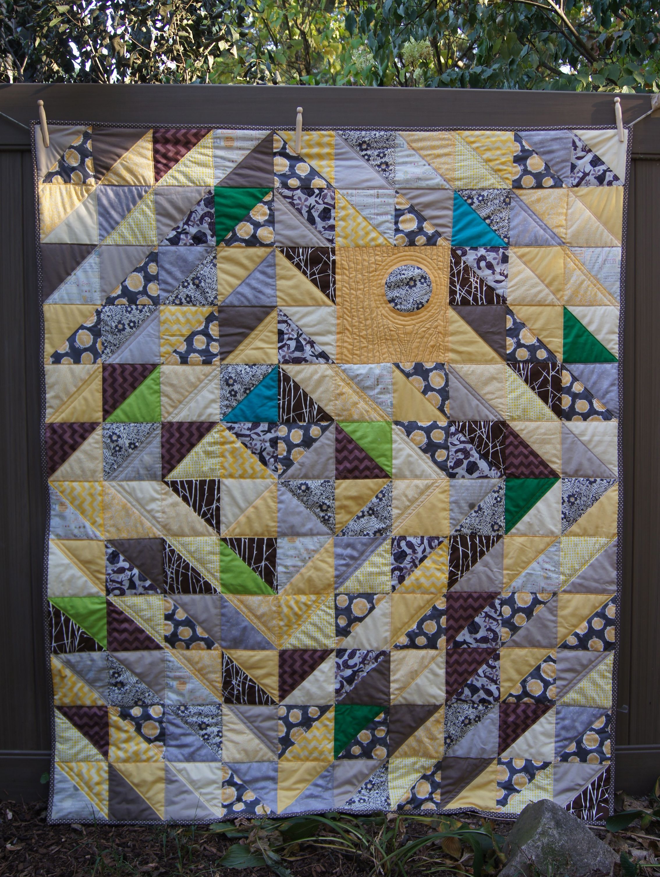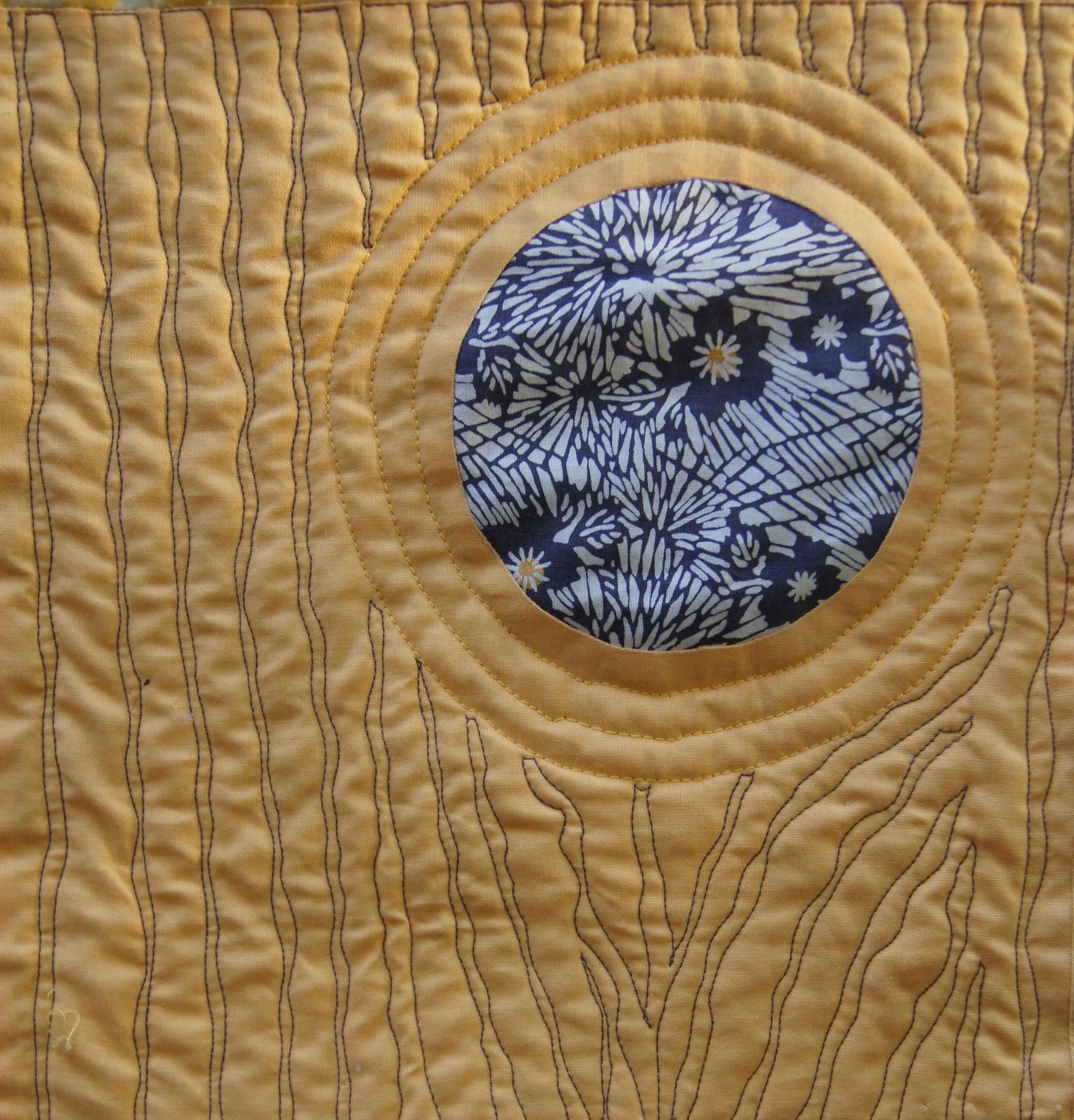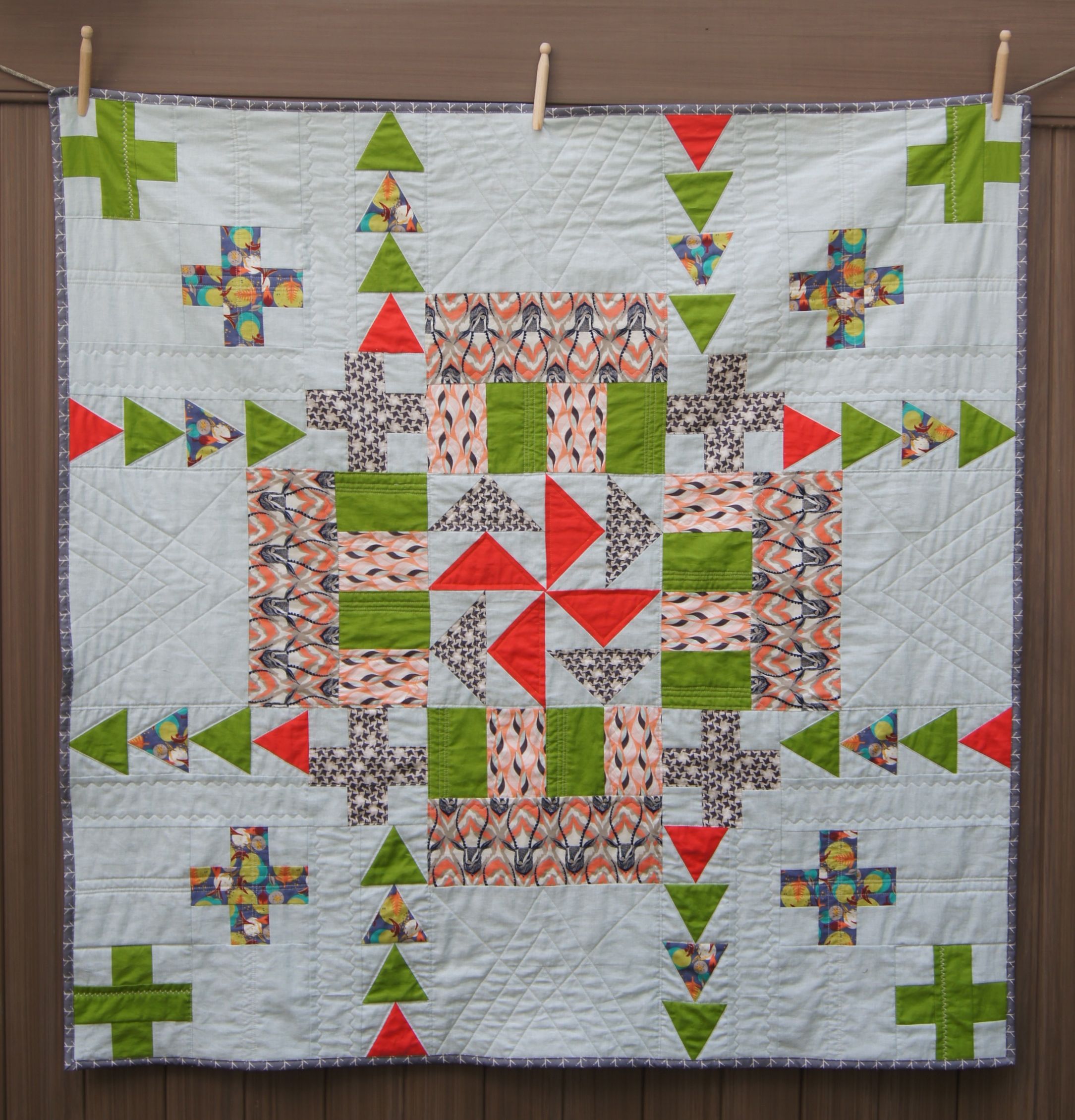
I've recently been working on several projects which have flying geese blocks. Two of the projects are for a class and I intentionally used half square triangles and quarter square triangles cut from squares to make the flying geese. So you don't need a special tool to make flying geese blocks, but sometimes it's great to have one.
You might want to use a Flying Geese Ruler if you are using scraps and don't have a large enough square of fabric to cut the pieces but you do have a strip of fabric which would work if you were using the specialty ruler. Or perhaps you are allergic to anything cutting which requires a measuring 7/8 inch, in which case, you are always going to reach for ruler to make your flying geese blocks!
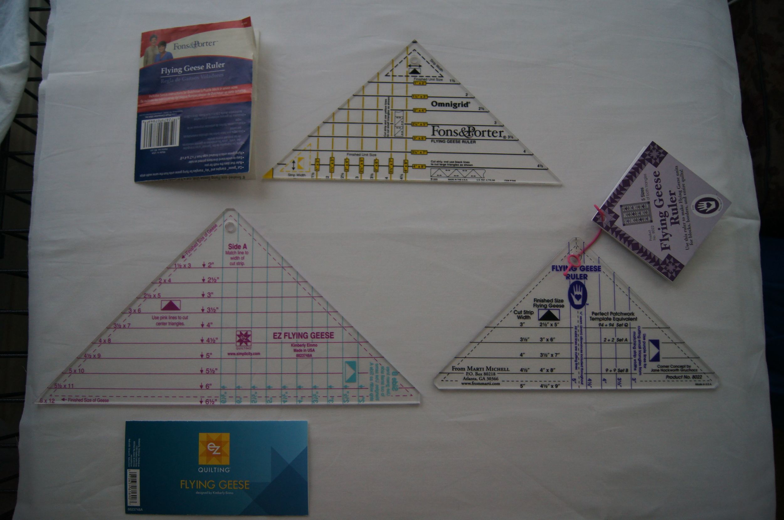
Shown above are 3 flying geese rulers which I've used. They all work well so I'm not going to recommend any particular ruler. Each of the rulers specifies the width of fabric strip you need to cut to make a specific size finished flying geese block. 1/4 inch seam allowances are automatically included with all 3 rulers so you don't need to use any math to make the correct size block. The 3 rulers do have minor differences and you may find there is one which you'd prefer.
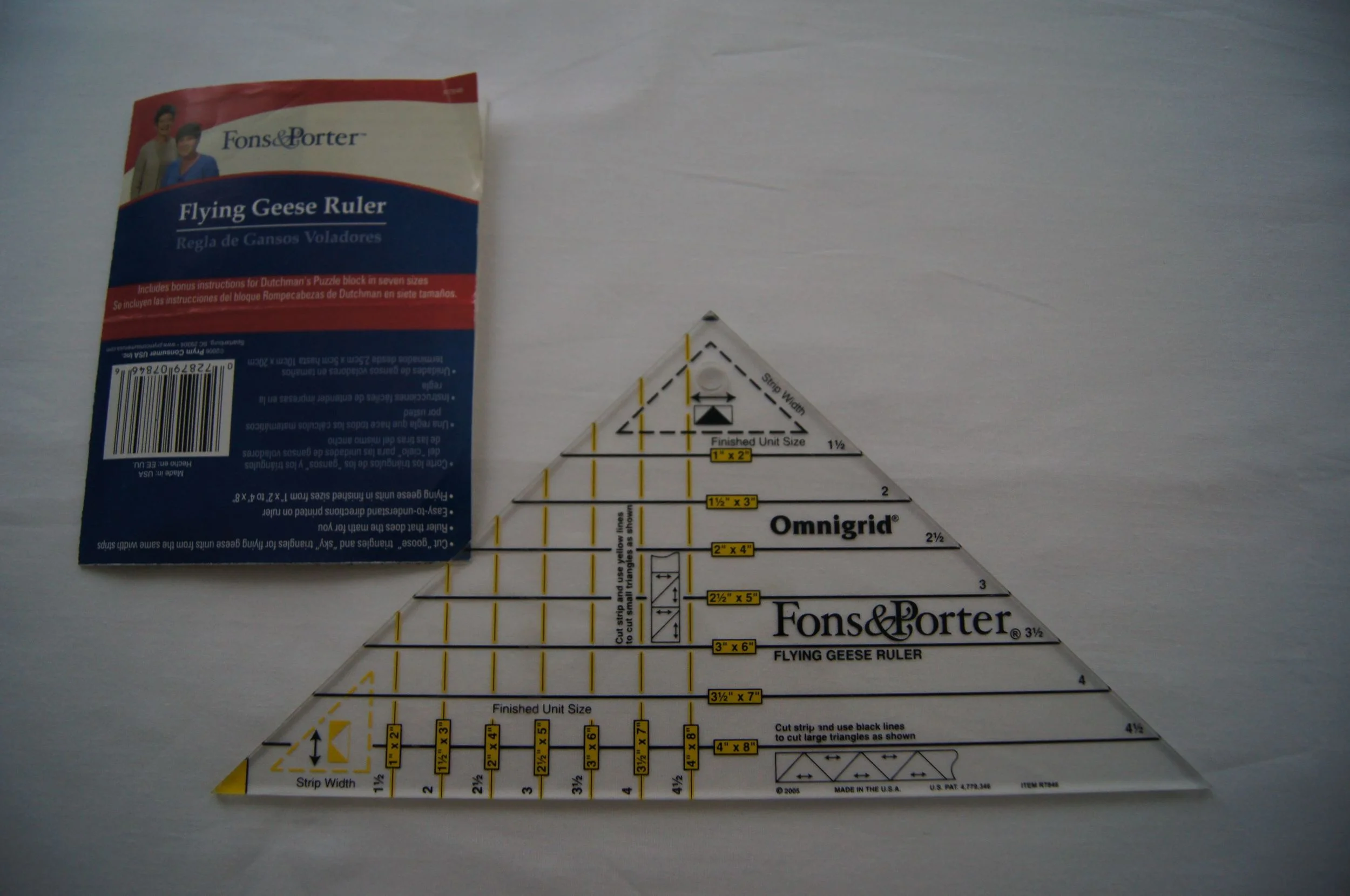
Fons & Porter Omnigrid Flying Geese Ruler
I've had the Fons & Porter Omnigrid Flying Geese Ruler the longest. It's a good straightforward tool. The quarter square triangles for the body of the goose are cut using the black lines and the wings are cut using the yellow lines. All the lines are printed on the same surface of the lucite. The tool is marked with to show the flat edge of the strip of fabric to you will be cutting but the tool itself isn't blunt. Using the marking does eliminate the dog ears on the finished block if you align the marking on the tool with the fabric strip. This tool is marked for flying geese from 1 x 2 inches to 4 x 8 inches.
The Fons & Porter Flying Geese Ruler comes with a full color booklet with a tutorial in English on one side and in Spanish on the flip side. It also includes a pattern for the Dutchman's Puzzle block.

Marti Michell's Flying Geese Ruler
Marti Michell's Flying Geese Ruler uses black lines to cut the quarter square triangles for the goose body and dark purple lines to cut the half square triangles for the goose wings. I don't see a lot of difference between the purple and black lines. However, since you are turning the ruler to cut each unit, I don't find that to be a problem. Markings are all on one side of the piece of lucite.
This ruler is marked to cut Flying Geese Units from 2 1/2 x 5 inches to 4 1/2 x 9 inches. All if the corners of the ruler are blunted so you can line up the flat top edge of the ruler with the edge of the fabric you are cutting. I like that feature. There are 2 flat edges on the long side of the ruler enabling you to make a block which is totally dog-ear free. I have to say, I didn't enjoy cutting that extra tip off with my rotary cutter. It just felt like it was an awkward angle. But if you want to avoid dog ears, this is the tool for you!
I did like the soft rubber piece holding on the instruction booklet. It slides easily on and off the ruler so it's a great way to keep the instructions attached to the tool. The instruction booklet had clear 2 color diagrams and instructions on chain piecing the blocks. It also has diagrams of 3 quilt blocks which can be made using this tool: Dutchman's Puzzle, Evening Star and Rambler.
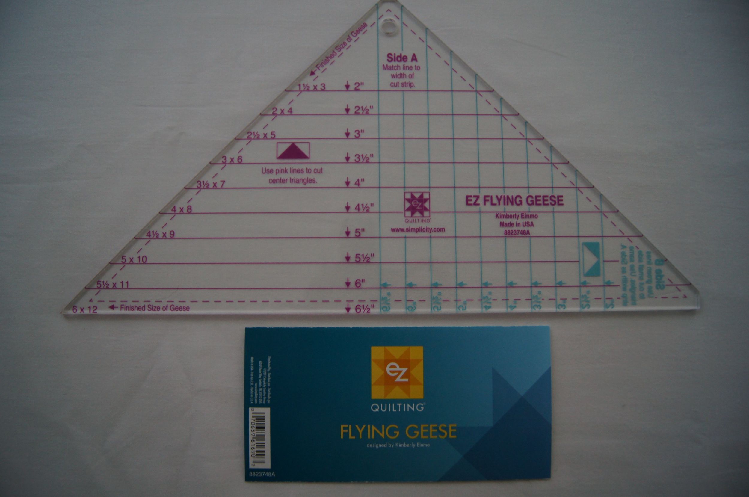
EZ Quilting Flying Geese Ruler by Kimberly Einmo/ Simplicity Creative Group
The EZ Quilting Flying Geese Ruler has magenta lines to cut the quarter square triangles for the goose body on "Side A". The aqua lines to cut the half square triangles for the wings are on the flip side of the lucite, "Side B". I found these markings to be easy to see when I was using dark fabrics.
This ruler is marked for flying geese units from 1 1/2 x 3 inches to 6 x 12 inches. There is a flat edge on 2 sides of the ruler which align with the top of of the strip of the fabric you are cutting. You will have dog ears on the lower edges of your finished block but not along the top of the block.
The flier with this tool has concise cutting instructions in English, French and Spanish. There are diagrams showing how to cut and construct the block but no text/tutorial to go with the diagrams. The booklet does include a chart showing the width of strip needed for each size of flying geese unit. This information is also printed on the ruler.
So, which tool to pick?
- If you are a beginner and want step by step instructions, or if you want to make really little flying geese blocks, the Fons & Porter tool is great.
- If you don't want to trim dog ears on your finished blocks, the Marti Michell tool is for you.
- If you know how to make flying geese blocks and want to make large flying geese blocks or if you are working with really dark fabrics, the EZ Quilting Flying Geese is your best choice.
So these tools have some differences, but in the end, all 3 make great flying geese blocks. The choice is yours! Buy what you can find and/or like best. You really can't go wrong.
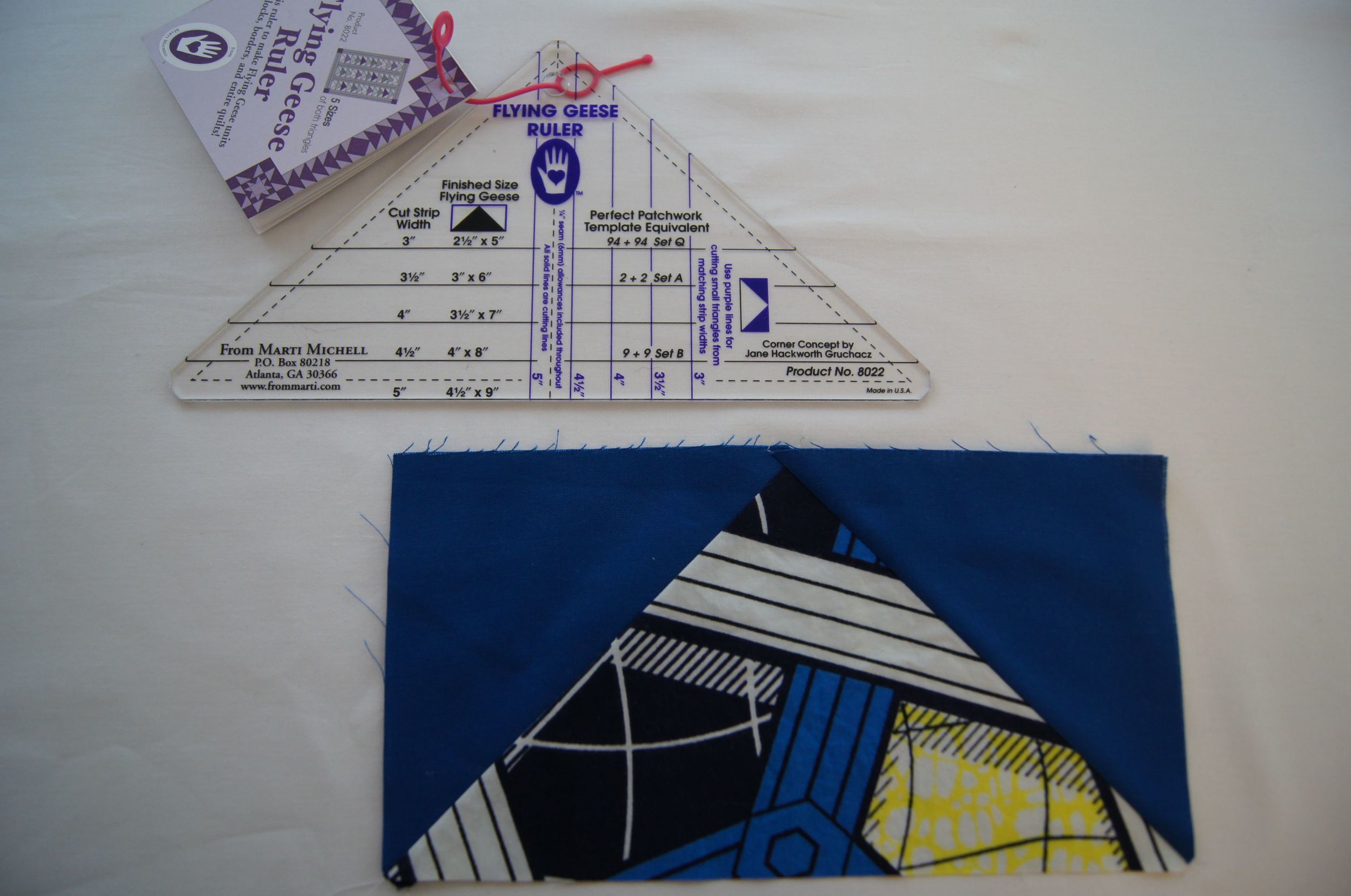
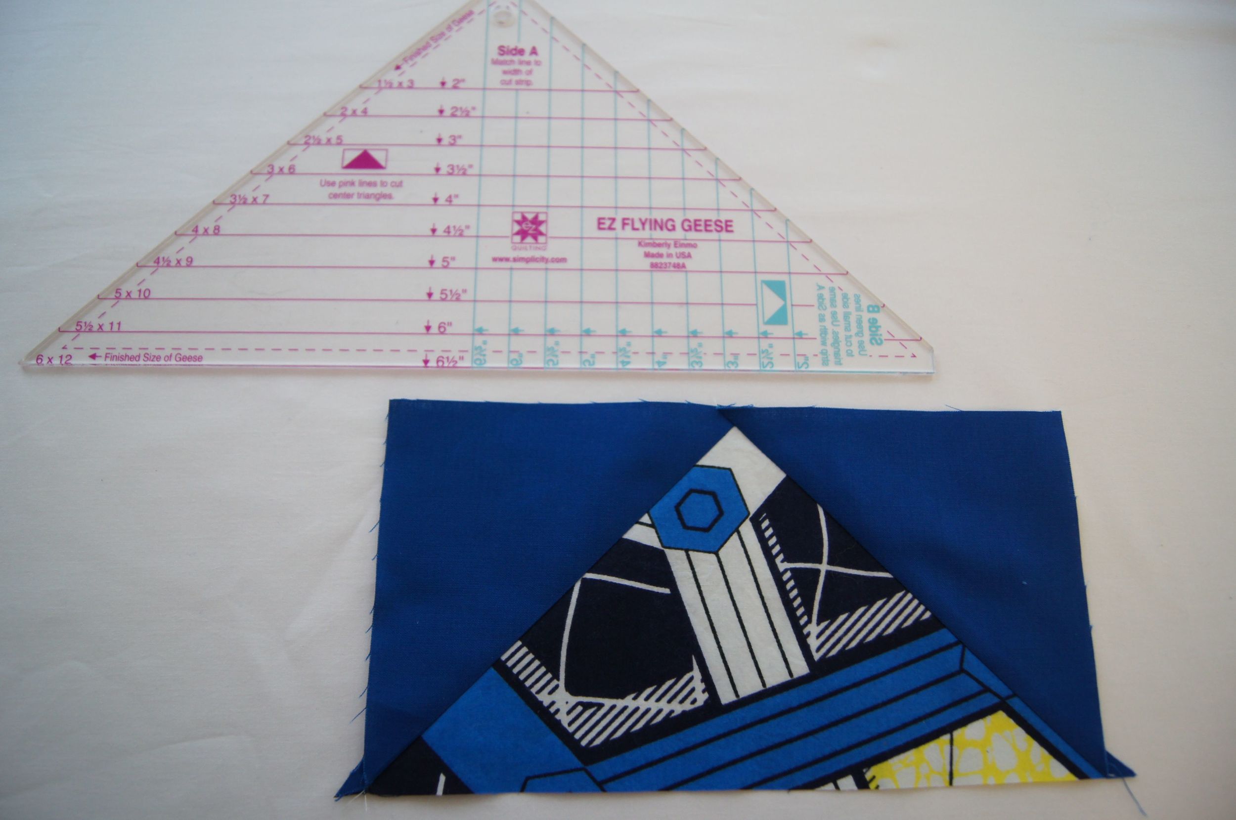
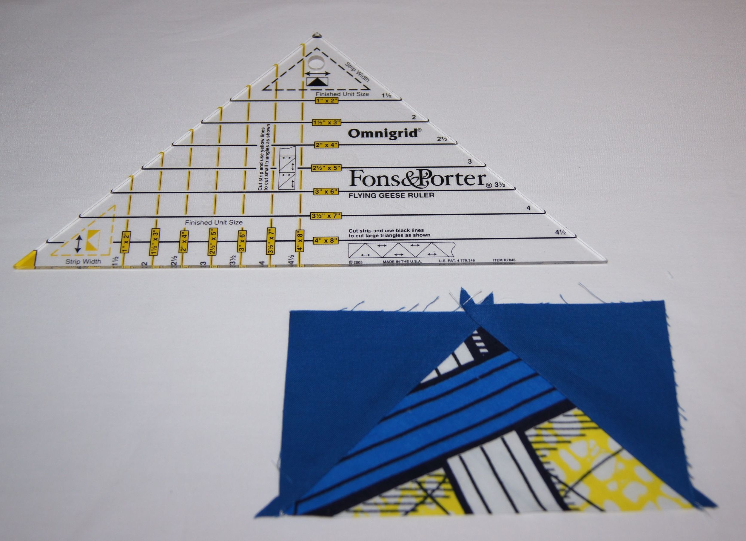
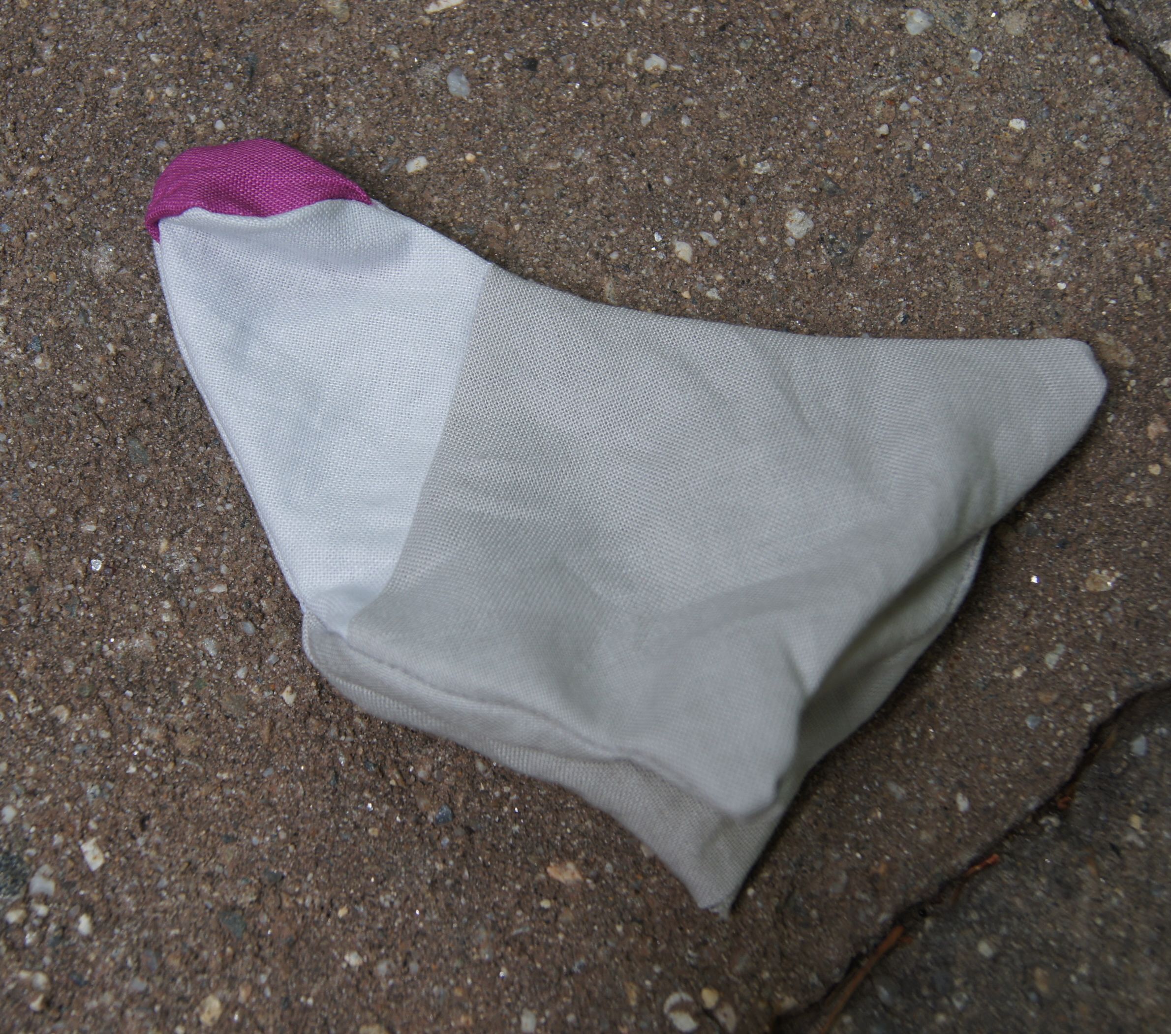
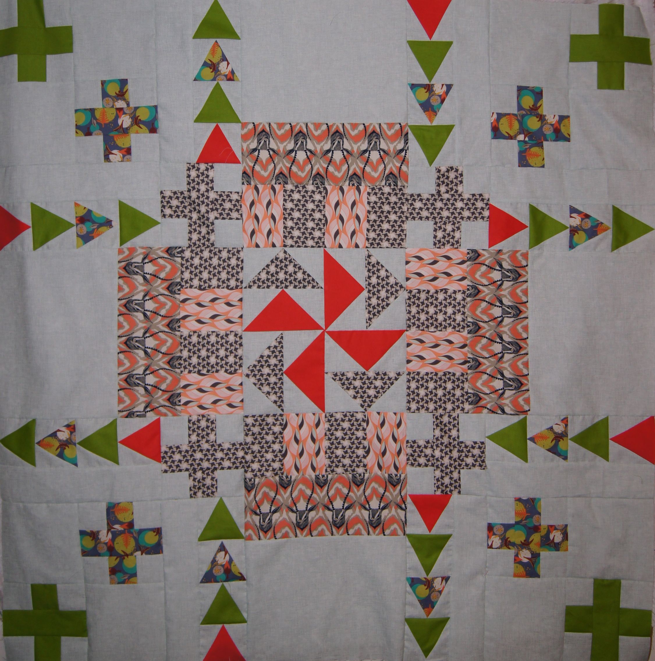
Here is a completed block made with each ruler. None have been trimmed or squared up yet.